PokerGo Tour
Online streaming responsive platform
Industry
Streaming
Services
UI & UX Design
Client
PokerGo
Year
2022/23
Background
PokerGO Tour is a professional poker tour created by PokerGO, a subscription-based streaming service that provides exclusive coverage of poker events and programming.
The events are broadcasted live on the PokerGO platform, and fans can follow along with the action and analysis from expert commentators. The PokerGO Tour aims to showcase the best players in the world and provide a platform for them to compete against each other in some of the most prestigious poker events in the world.
The Problem
The current platform is plagued by bugs, lack of UX design, and a complicated interface that has negatively impacted the company's user engagement and revenue growth.
Goals
Increase user engagement: The platform's design needed to be engaging and user-friendly, encouraging users to explore the content and watch more videos.
Enhance user experience: The platform needed a seamless and enjoyable user experience, with easy navigation and quick access to all the content.
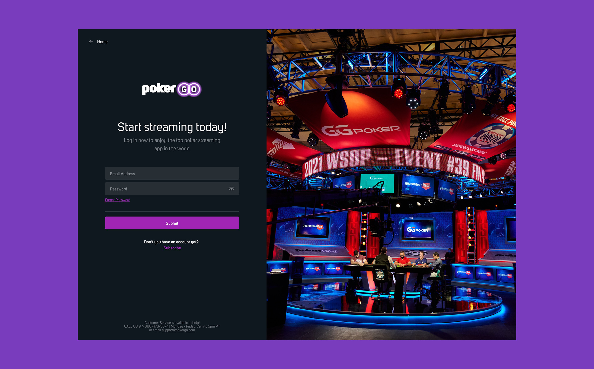
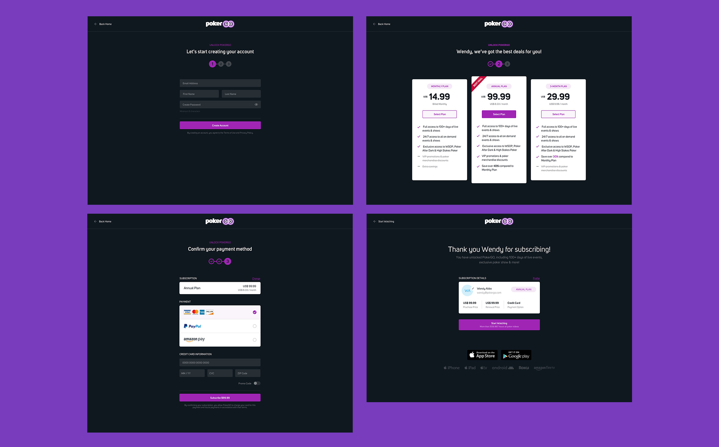
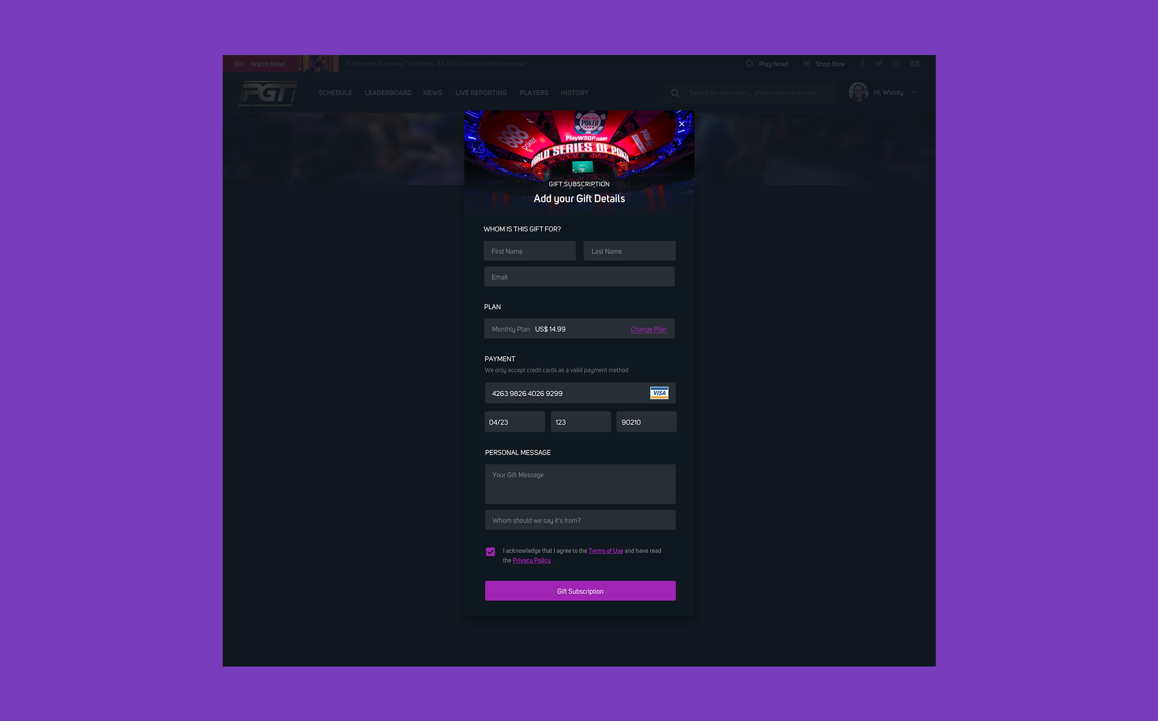
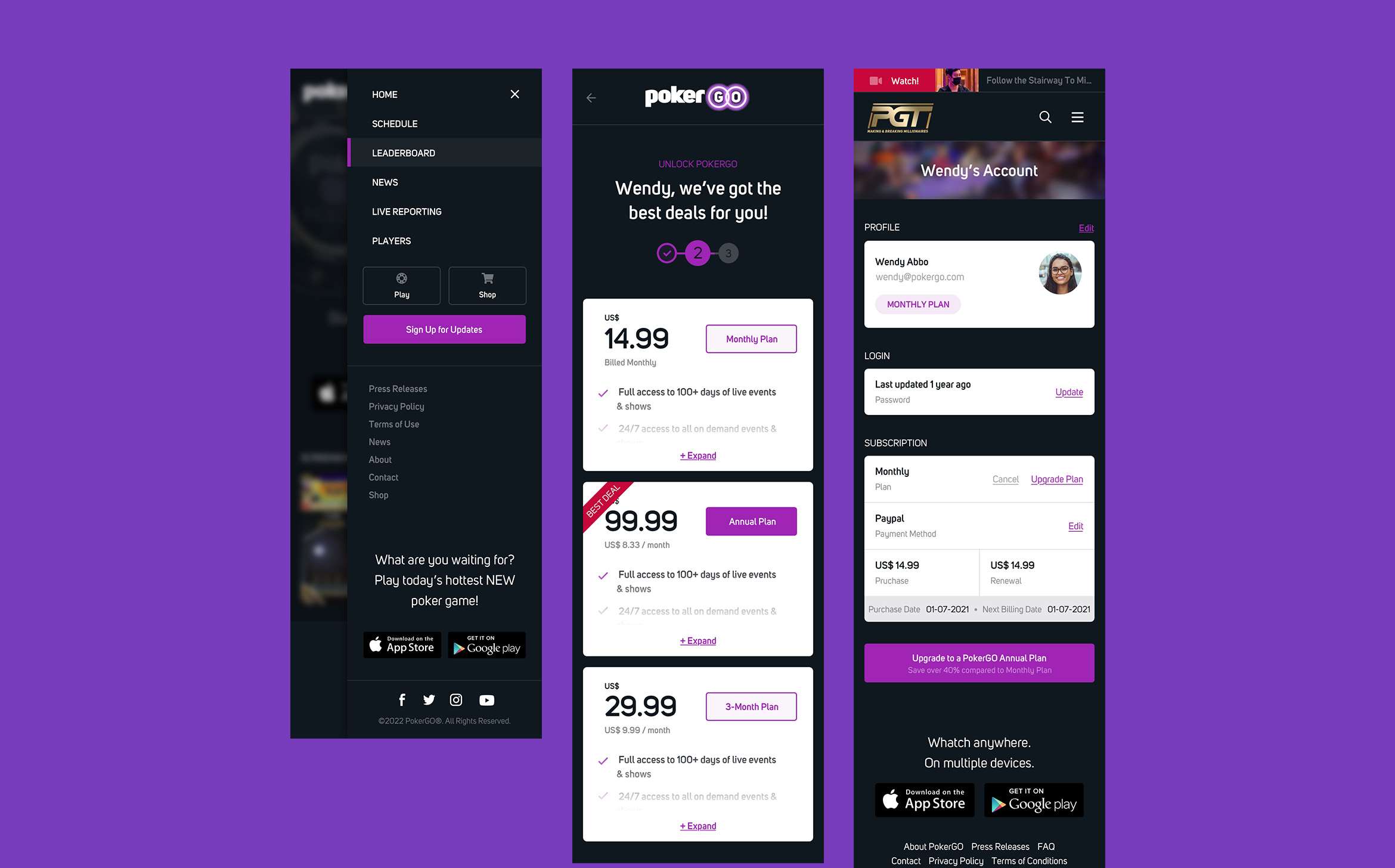
Drive revenue growth: The platform design must be optimized for revenue growth, with clear calls to action and easy subscription options.
In conclusion, the main objective is to create a more streamlined, visually appealing, and intuitive platform design that will attract more users and increase revenue for the company.
Features
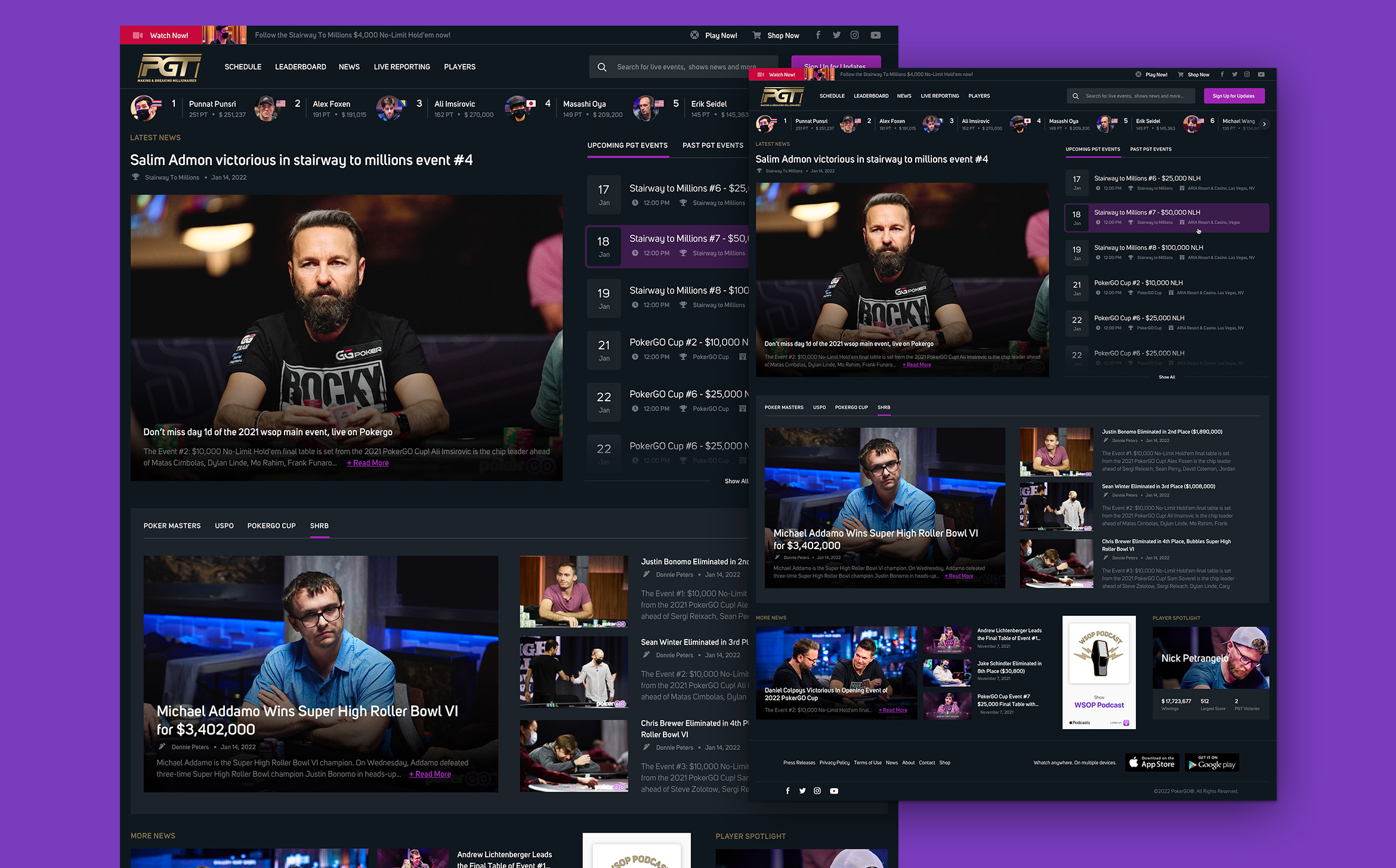
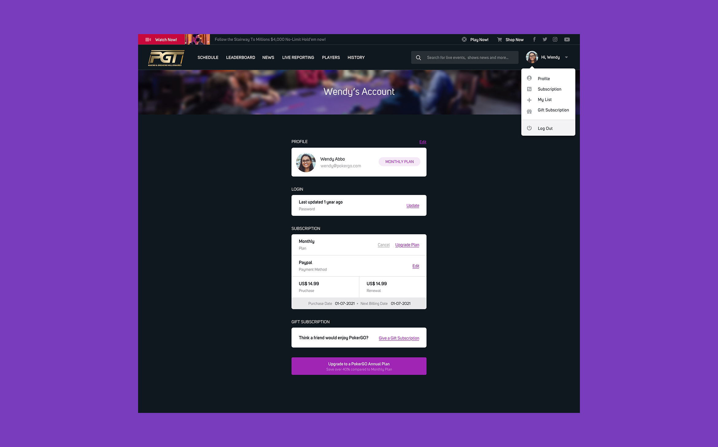
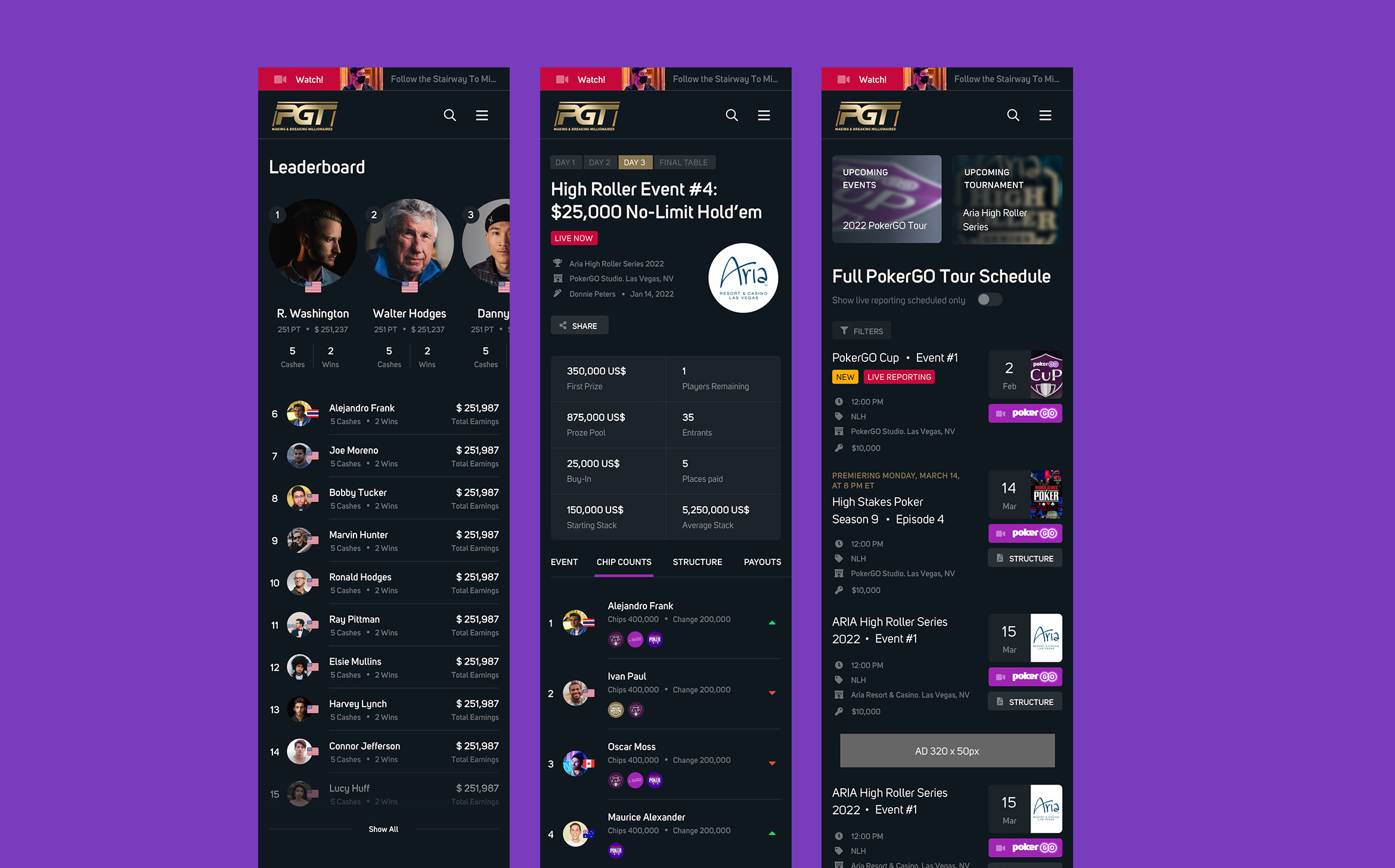
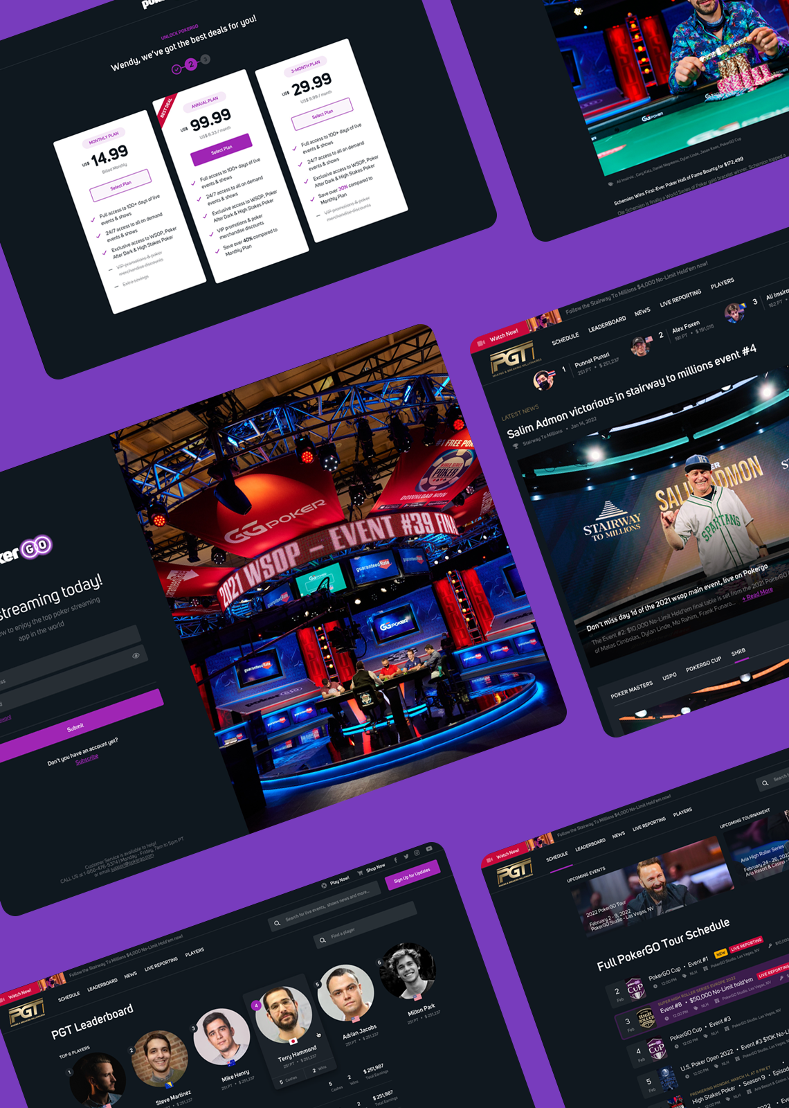
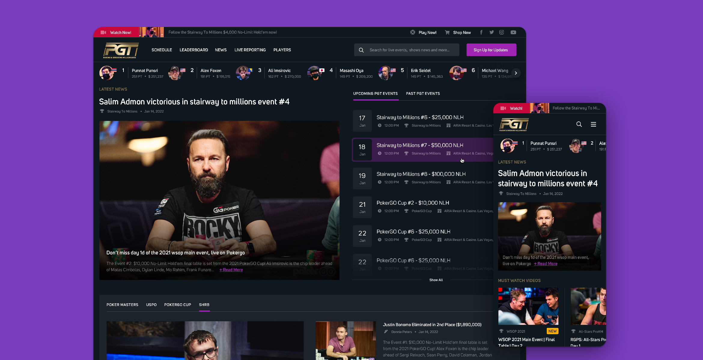
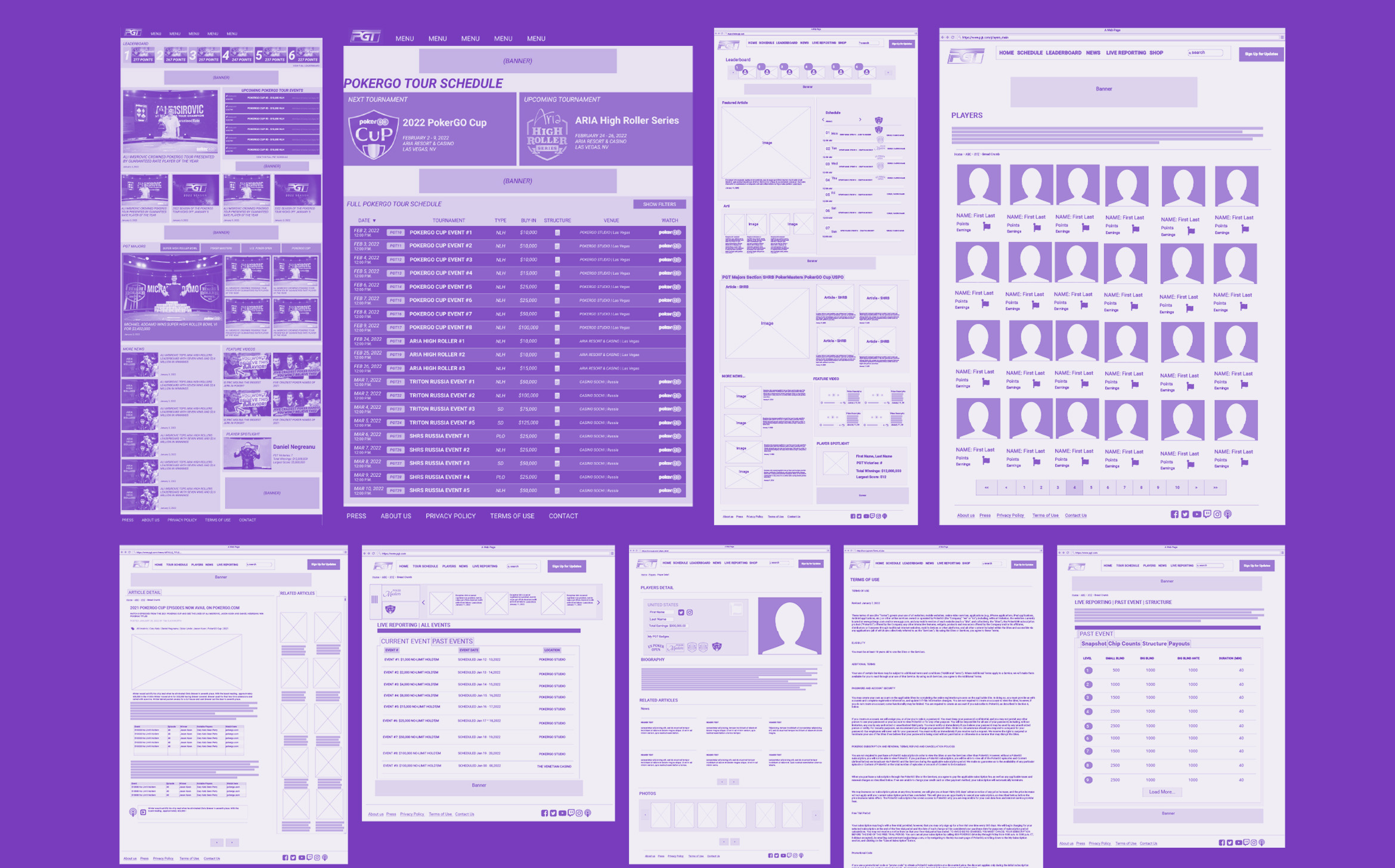
The PokerGO online platform features a schedule for all the events, a leaderboard section, detailed information about the players, live reporting, blog, and shop area. Let's dive deeper into each of these features and the UX/UI design considerations:
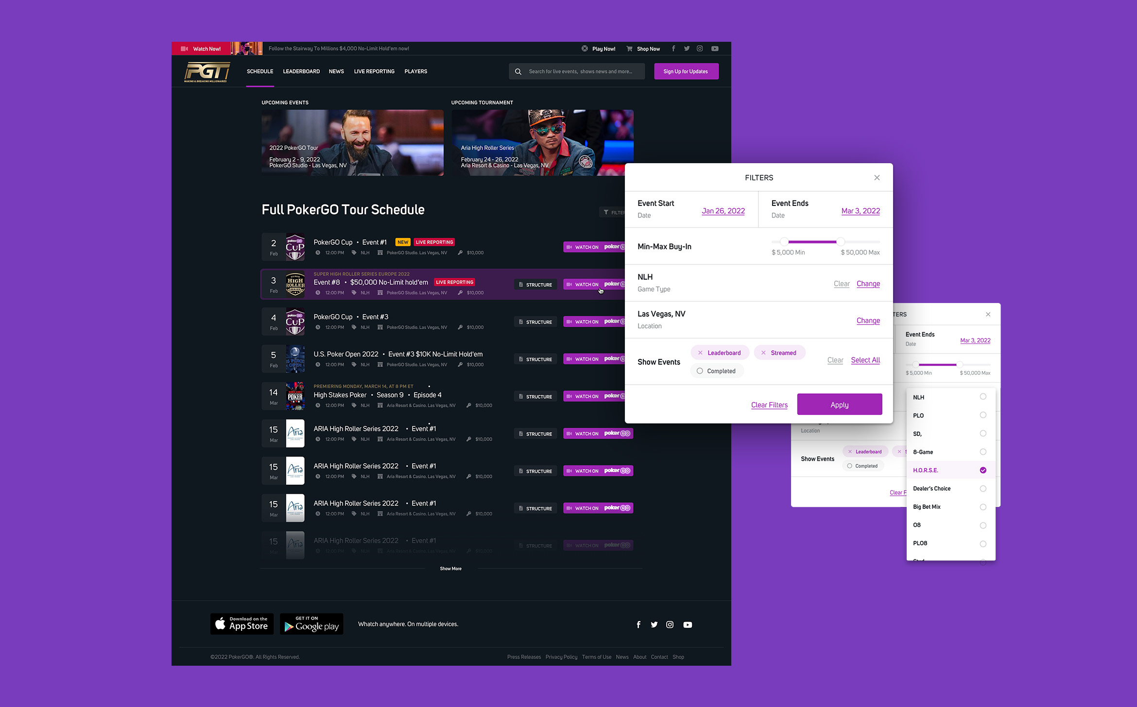
Schedule Allows users to see all the upcoming events, with a clear date, time, and information about the tournament. The UX/UI design is straightforward, with clear typography and a color-coded calendar system to easily distinguish between the events. Users can easily navigate through the different events and view more detailed information by clicking on each event.
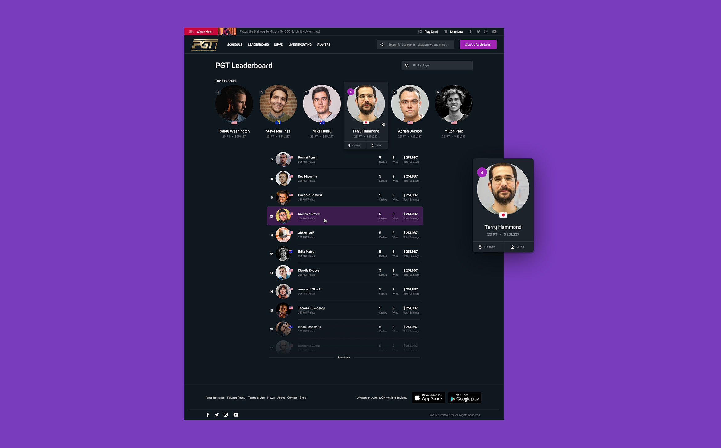
Leaderboard Allows users to track their favorite players' performance throughout the tournament. The UX/UI design is simple, with clear typography and a clean, minimalist layout. Users can easily view the current standings and click on each player to see more detailed information about their performance.
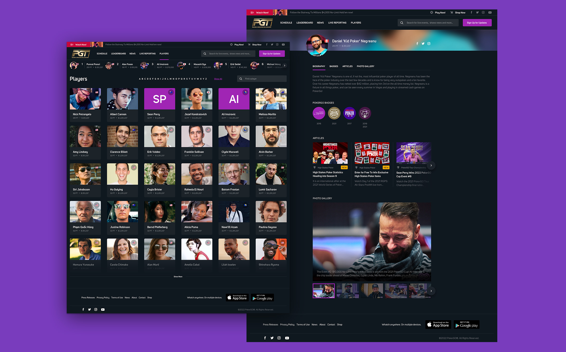
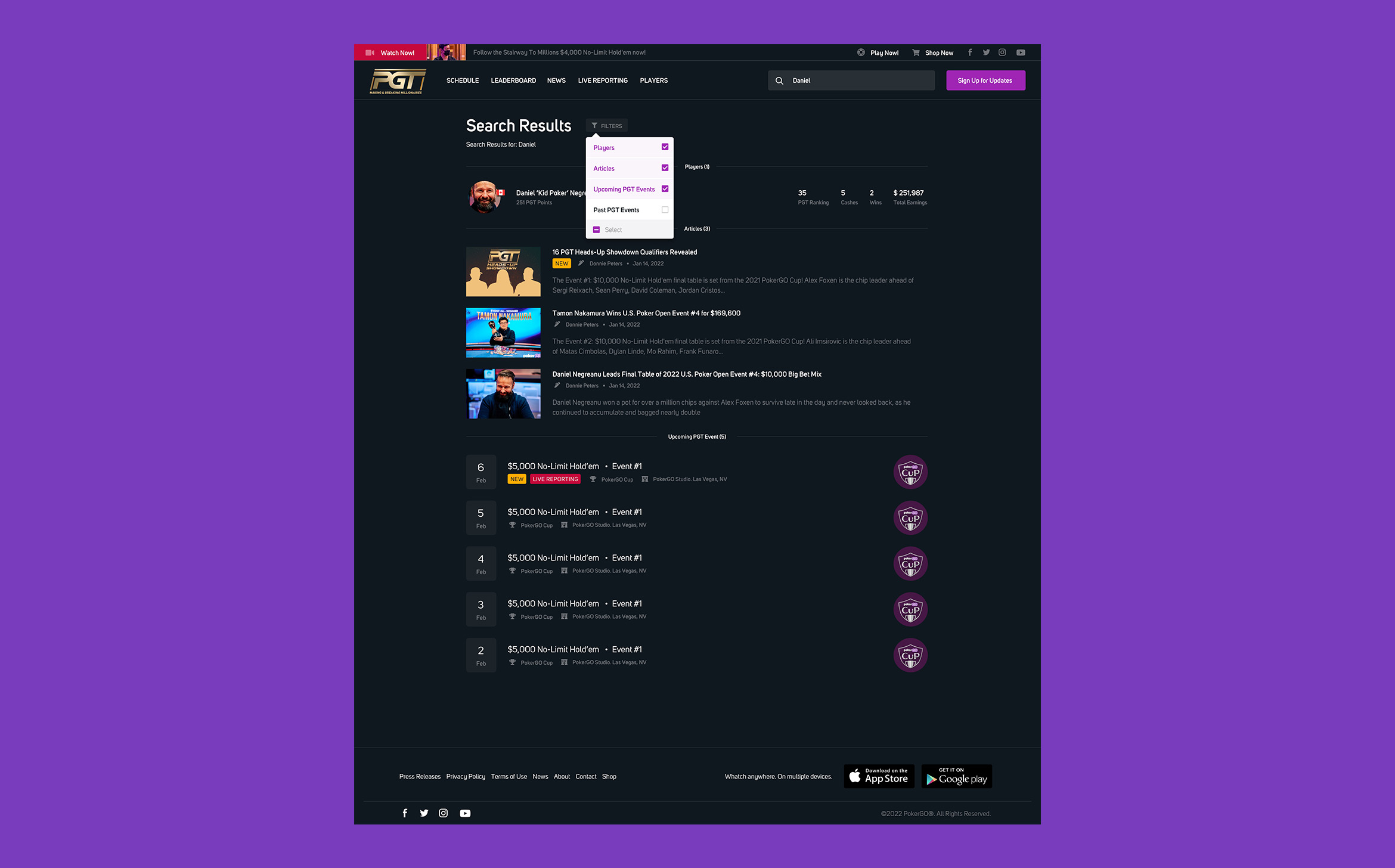
Player Profiles Provides users with detailed information about each player, including their bio, tournament history, and stats. The UX/UI design is engaging, with large images of each player and an easy-to-read layout. Users can easily navigate through the different players and view more detailed information by clicking on each player.
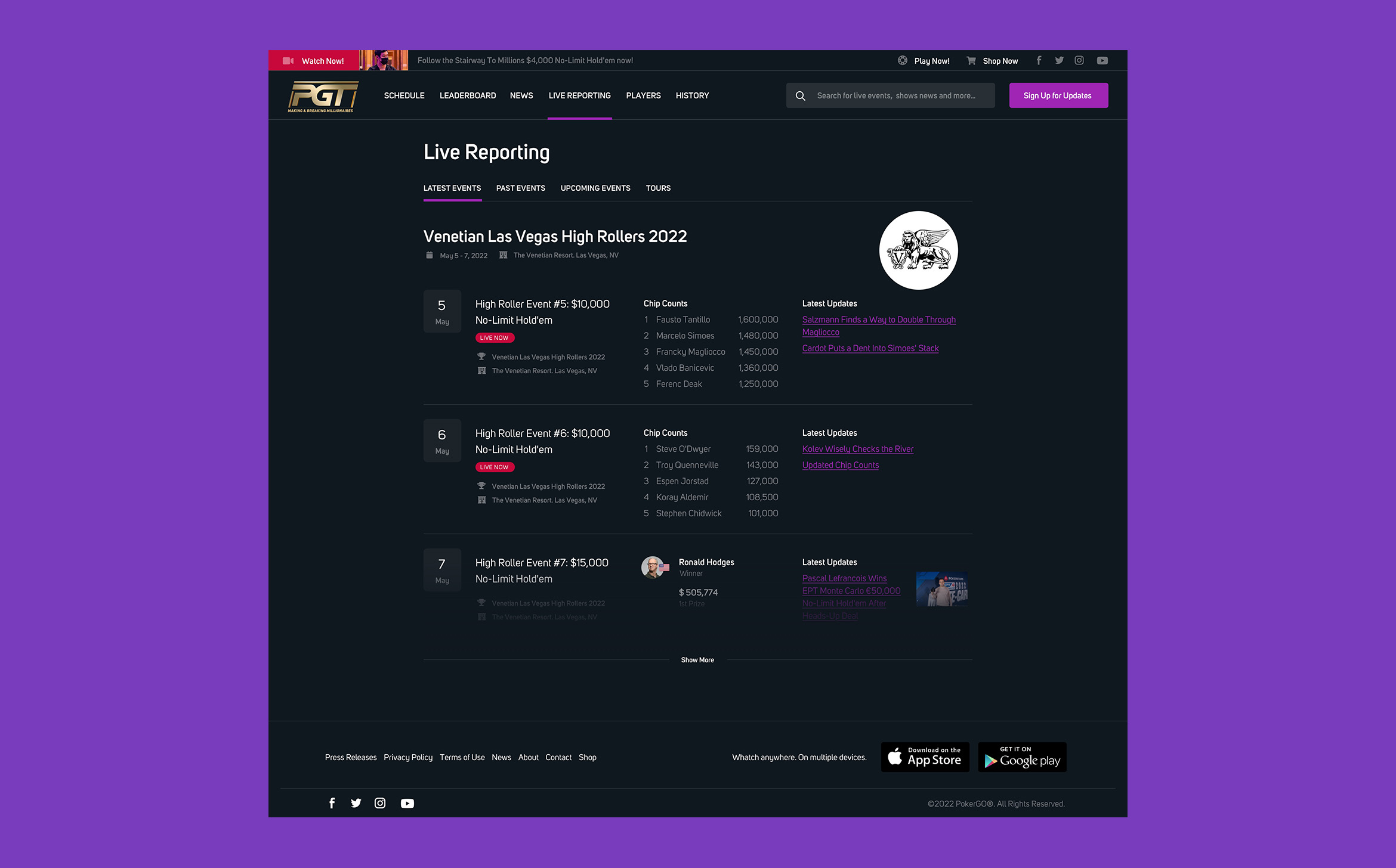
Live Reporting Provides users with real-time updates and news about the tournaments. The UX/UI design is clean, with a simple layout and easy-to-read typography. Users can easily navigate through the different news stories and view more detailed information by clicking on each article.
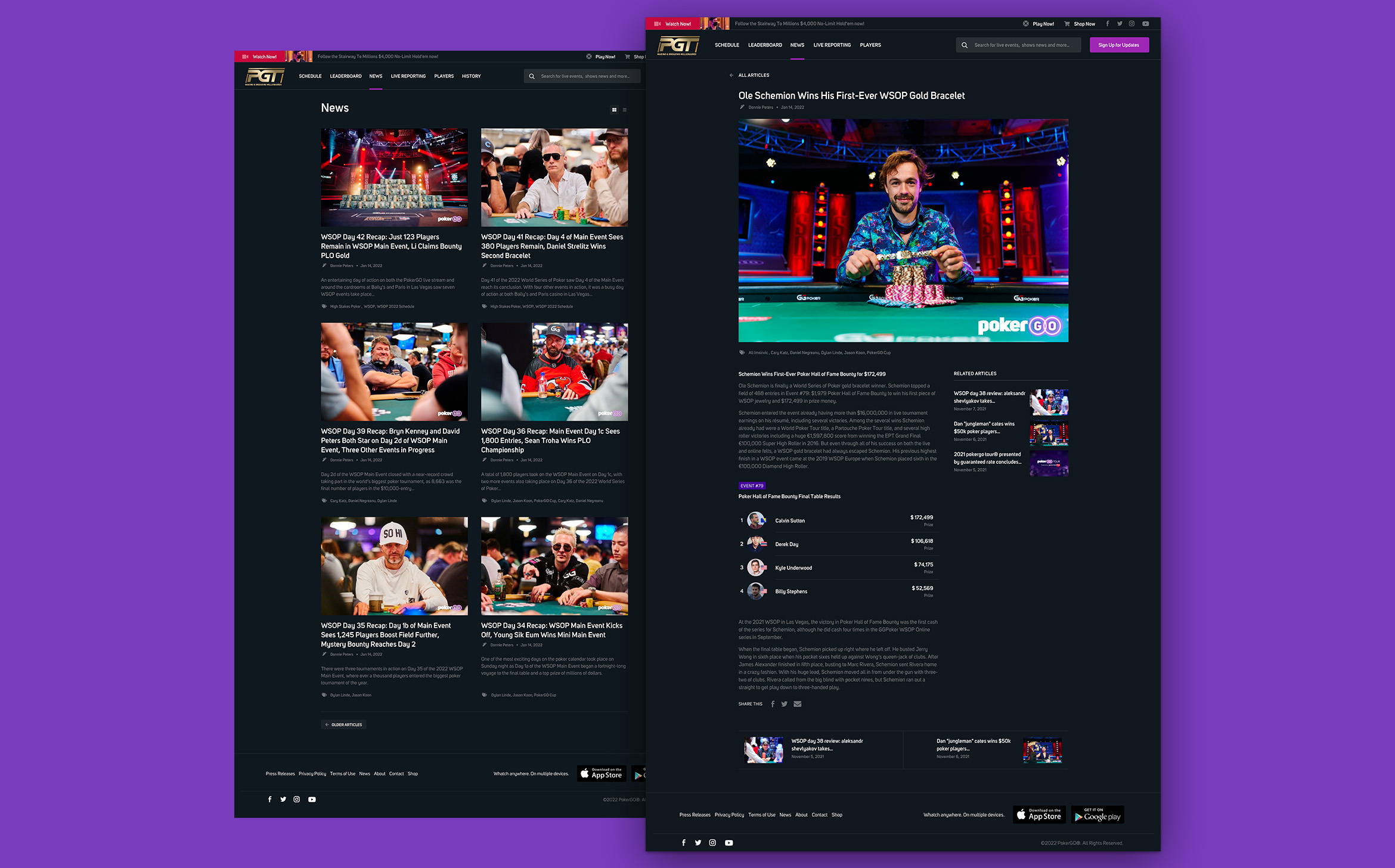
Blog Provides users with original content related to poker, including strategy tips, player interviews, and news. The UX/UI design is engaging, with large images and an easy-to-read layout. Users can easily navigate through the different articles and view more detailed information by clicking on each post.
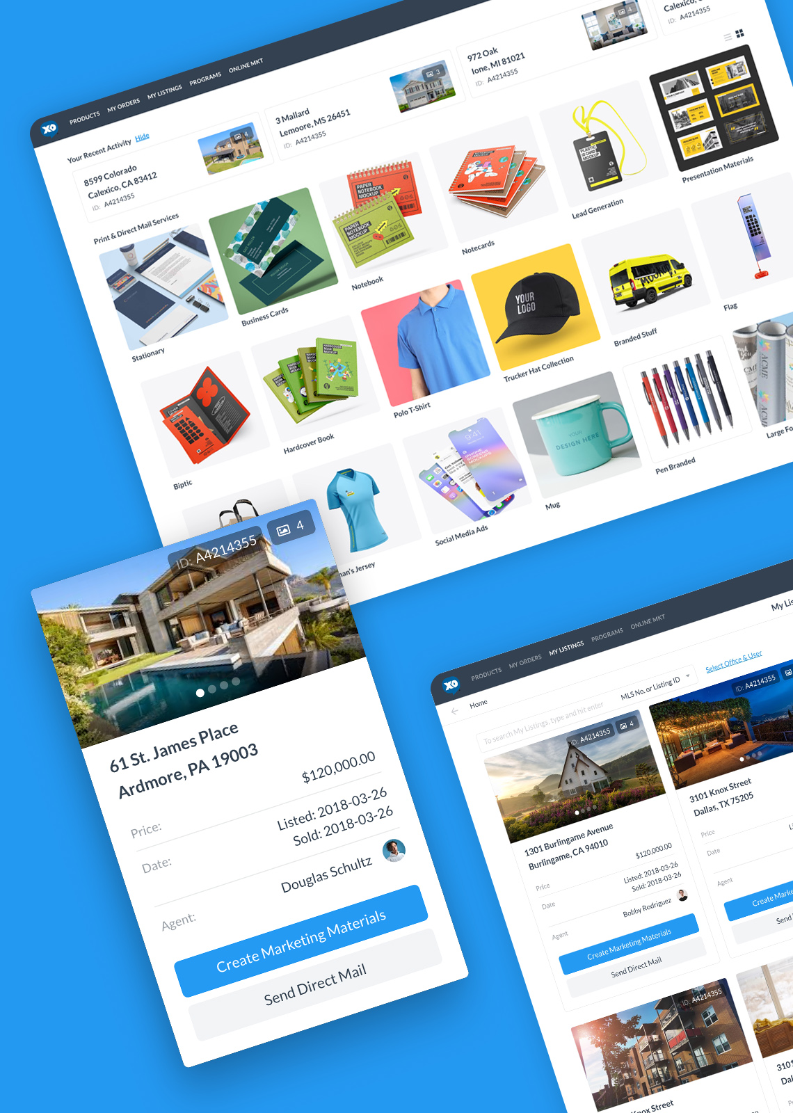
Shop Allows users to purchase merchandise related to the platform and the tournaments. The UX/UI design is clean, with a simple layout and easy-to-use navigation. Users can easily browse through the different products and add them to their cart for purchase.
Mobile
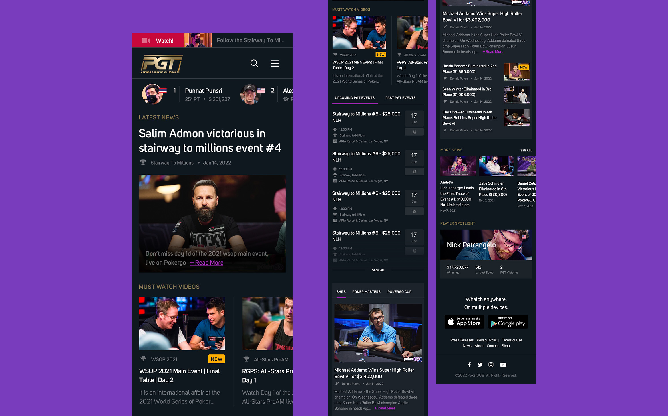
The challenge was to create an intuitive and engaging user experience despite the limited screen space. They had to balance complex poker gameplay information with a visually pleasing interface, effectively display crucial game data, optimize touch interactions, and integrate social and competitive elements seamlessly. Despite these challenges, I successfully enhanced user enjoyment and competitiveness on the mobile platform.
Results
In summary, the redesign of the multi-platform dashboard for a poker streaming service company has resulted in significant improvements in user engagement, user experience, revenue growth, and website conversion. The new design has provided a more streamlined, visually appealing, and intuitive platform for users, resulting in a 30% increase in user retention and a 20% increase in user acquisition. The enhanced user experience has resulted in a 25% reduction in customer support tickets related to navigation and functionality issues. The redesigned dashboard has also increased revenue, with a 15% increase in subscription revenue and a 10% increase in merchandise sales. Additionally, the new design has improved website conversion, resulting in a 35% increase in the number of users signing up for a subscription. Overall, the redesign has proven to be a major success for the company.
Selected Works
