tumonedero
Earn, learn & trade with crypto
Industry
Crypto
Services
UI & UX Design
Client
tumonedero
Year
2022/23
Background
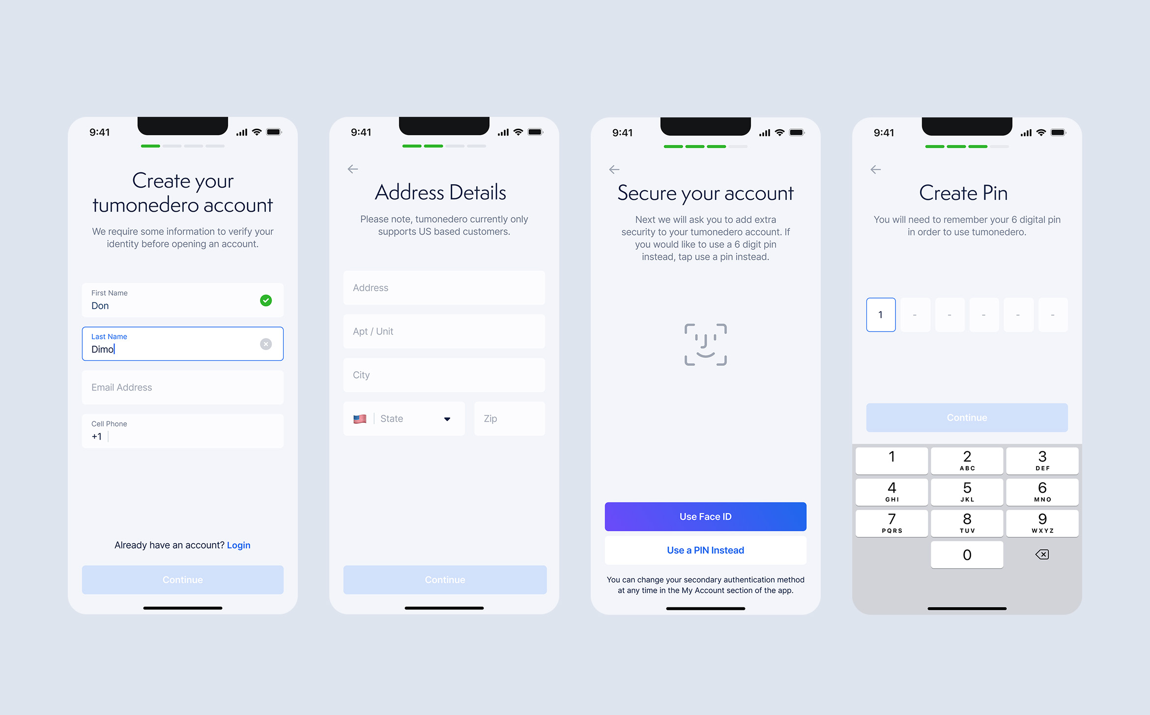
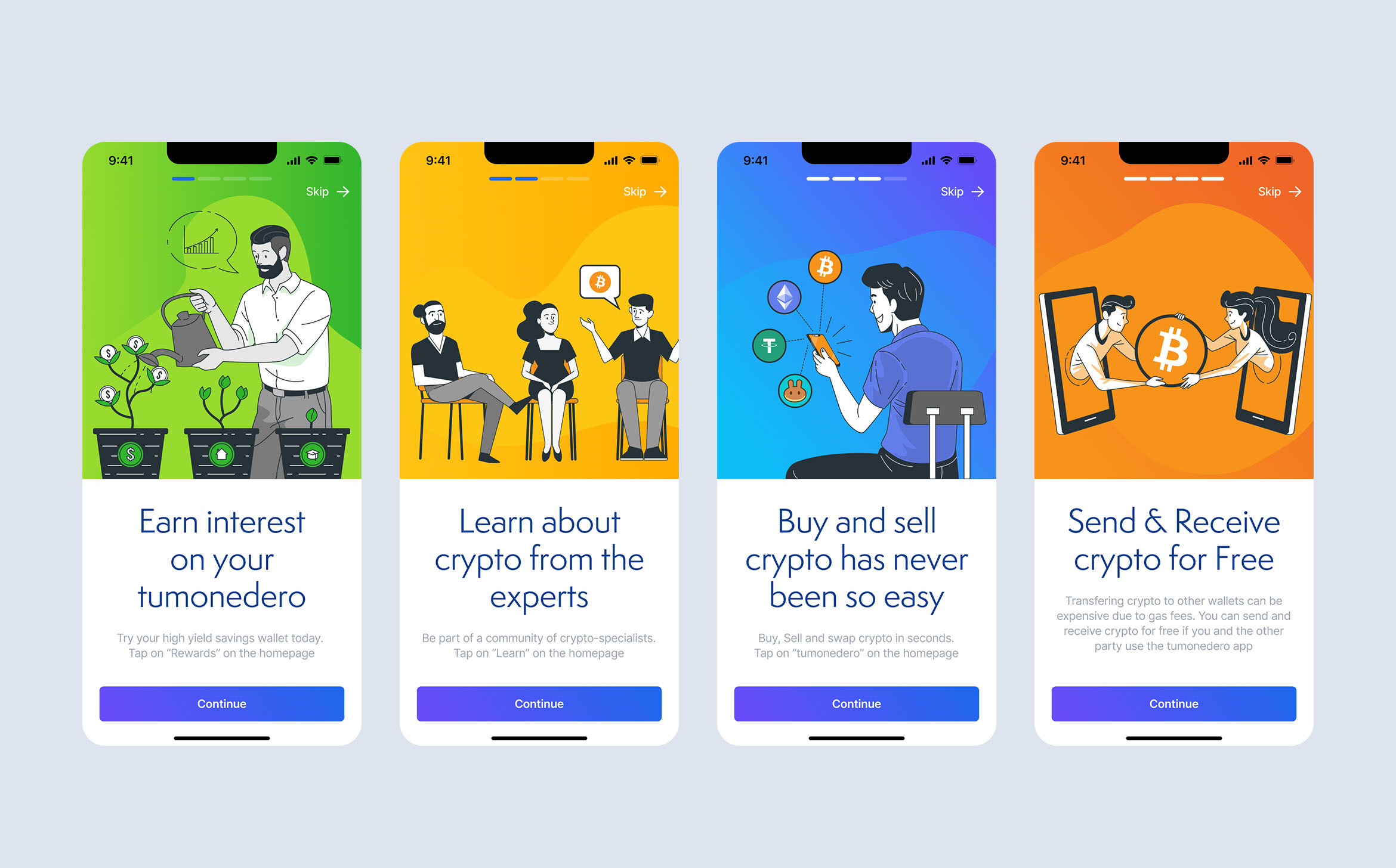
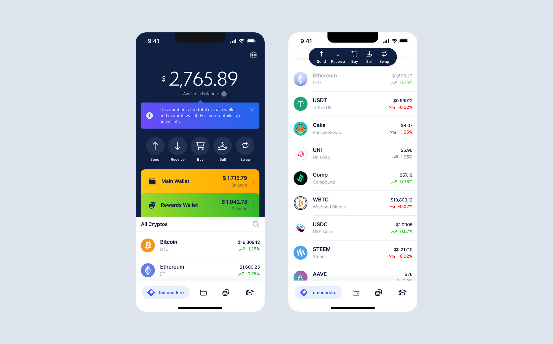
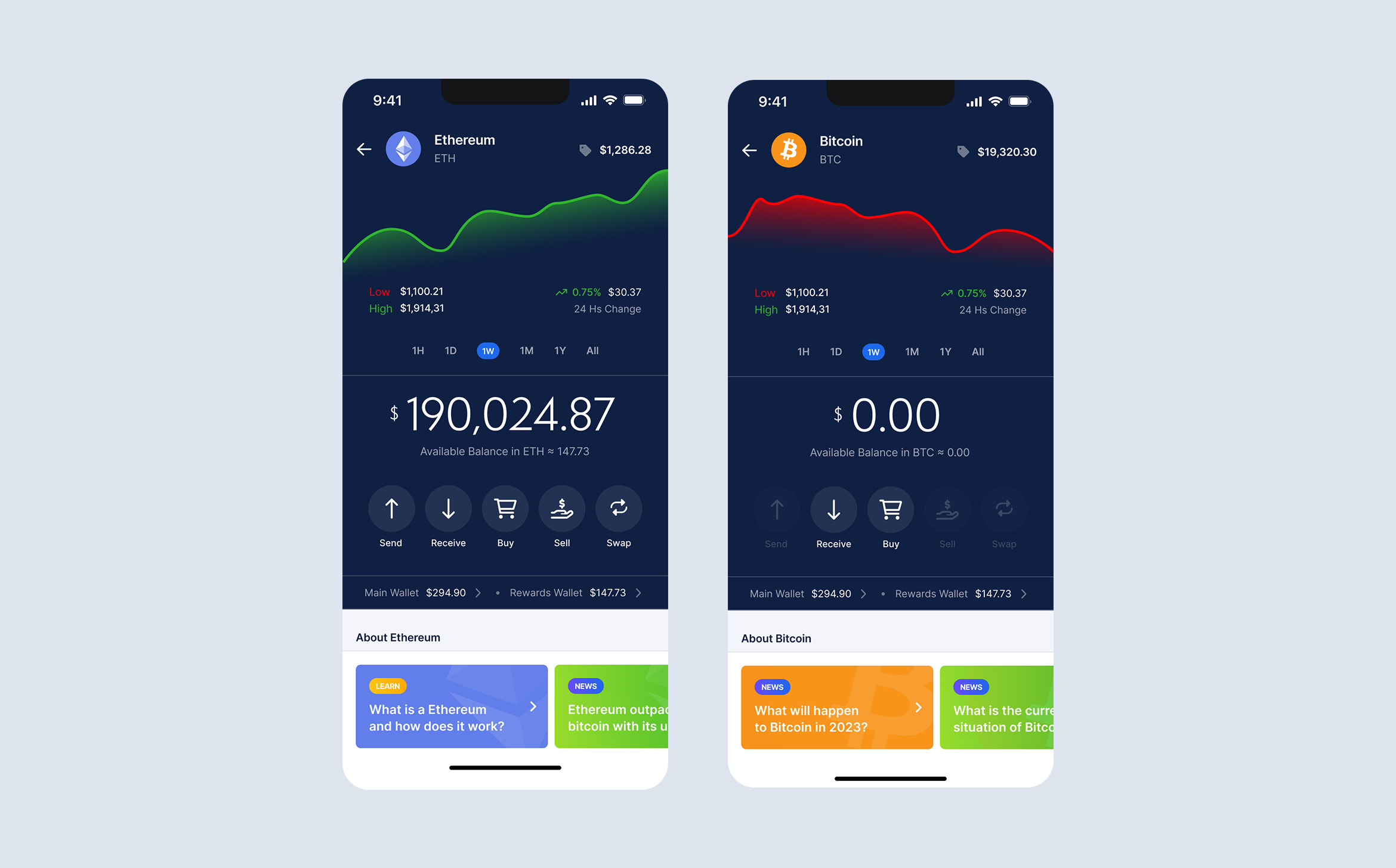
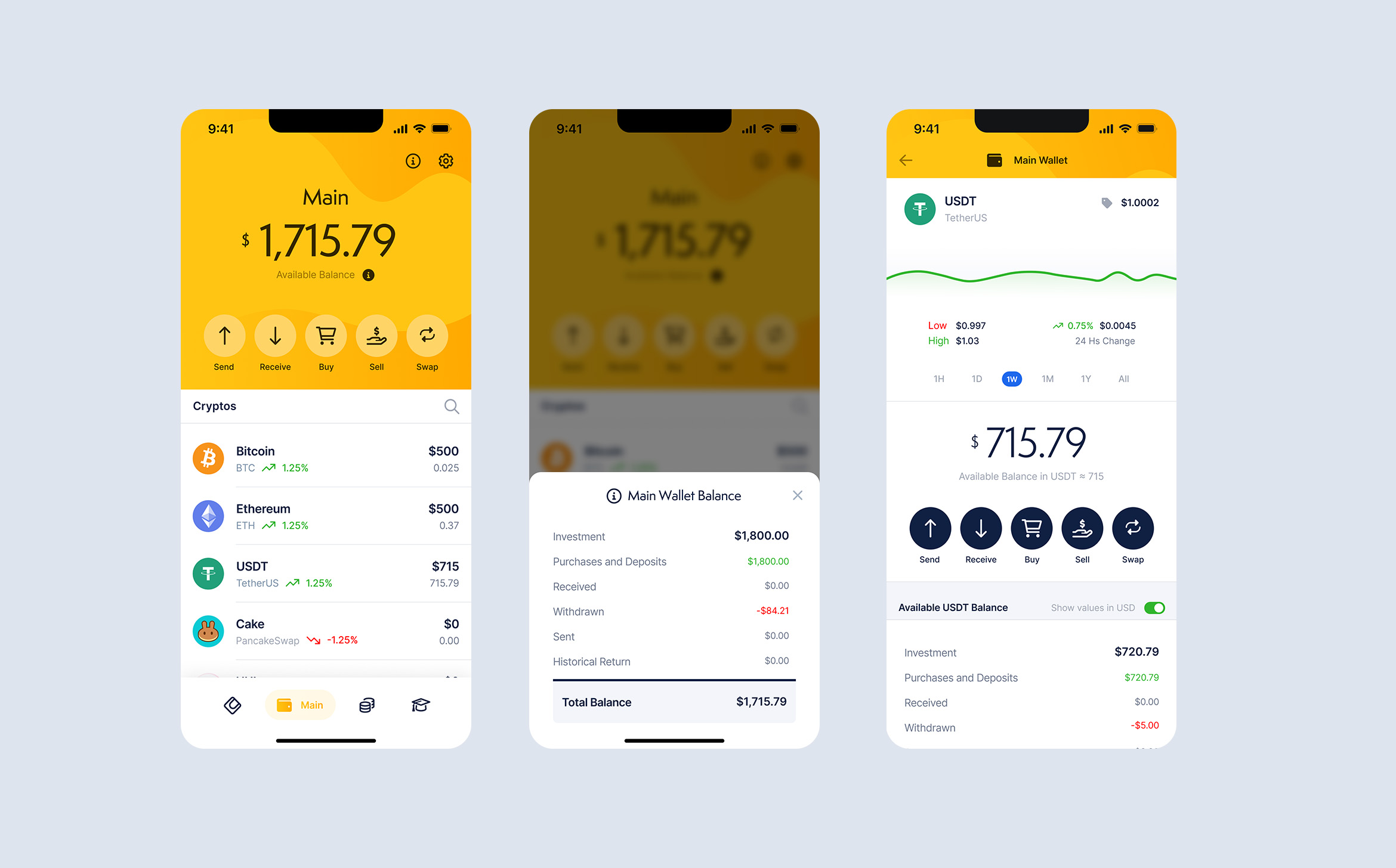
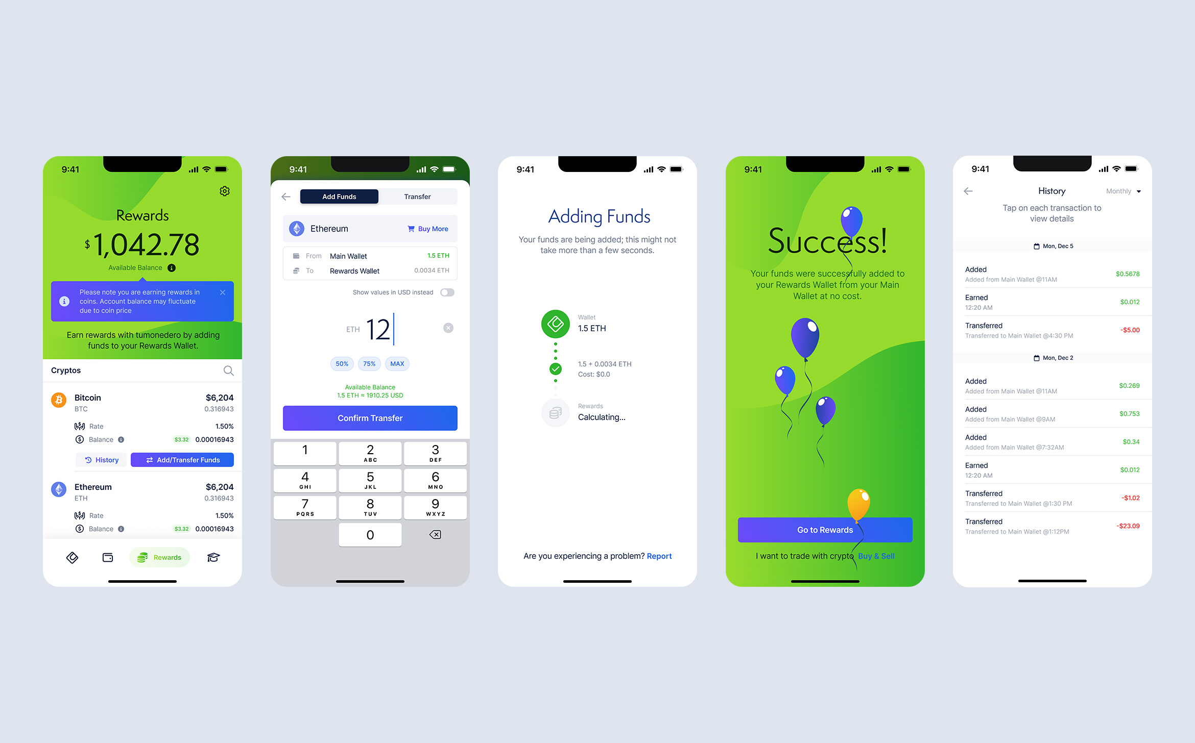
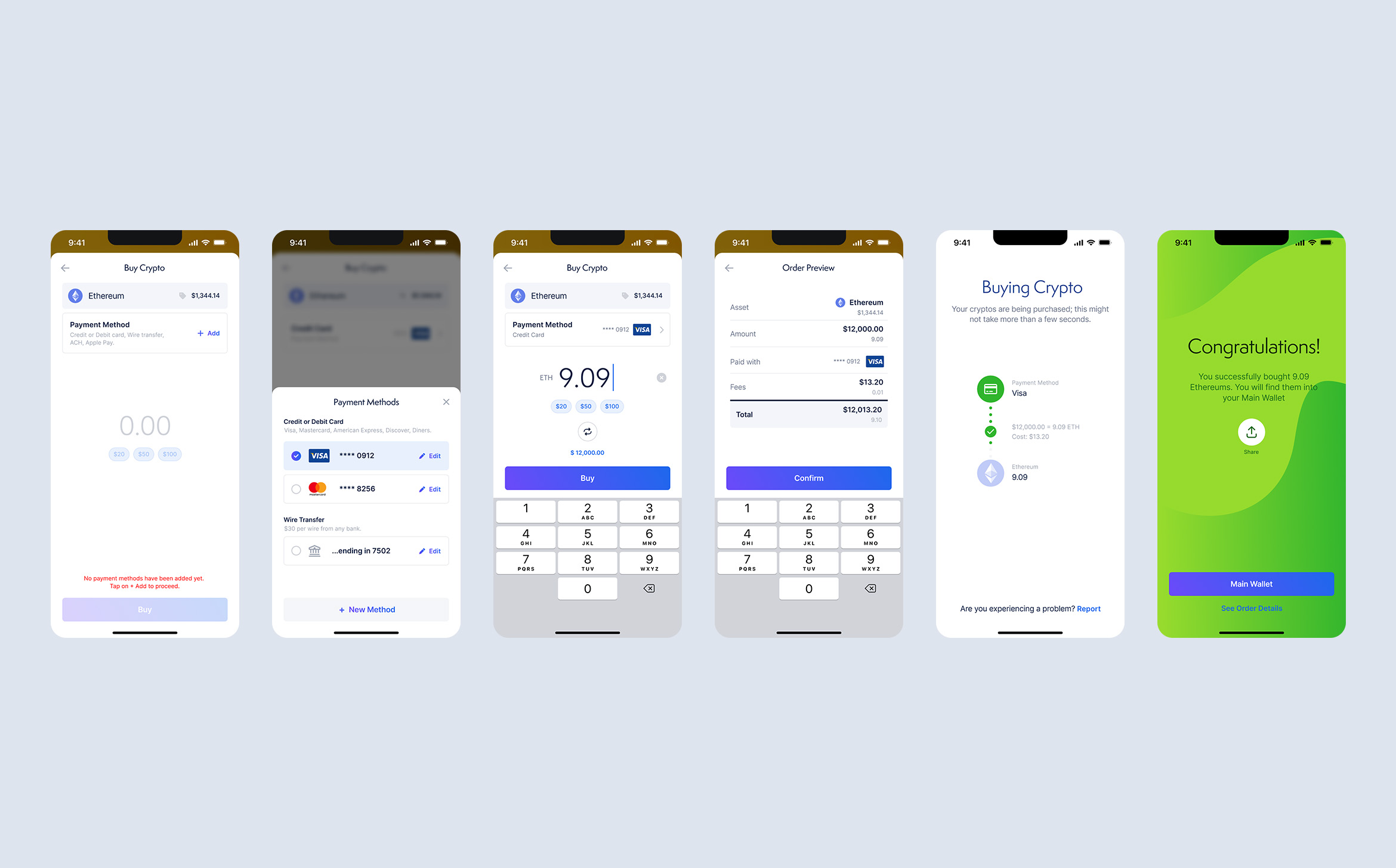
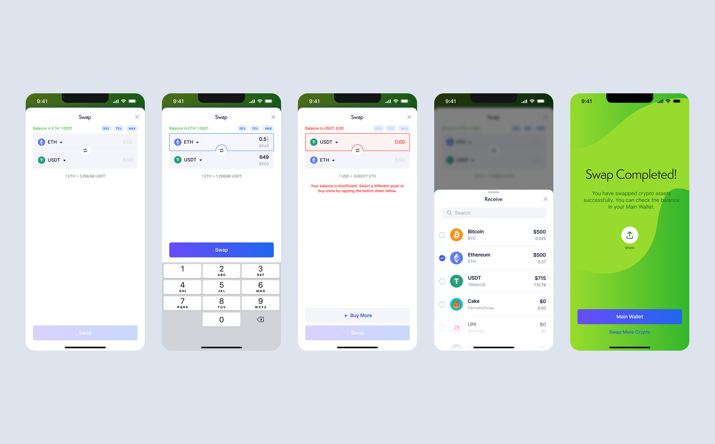
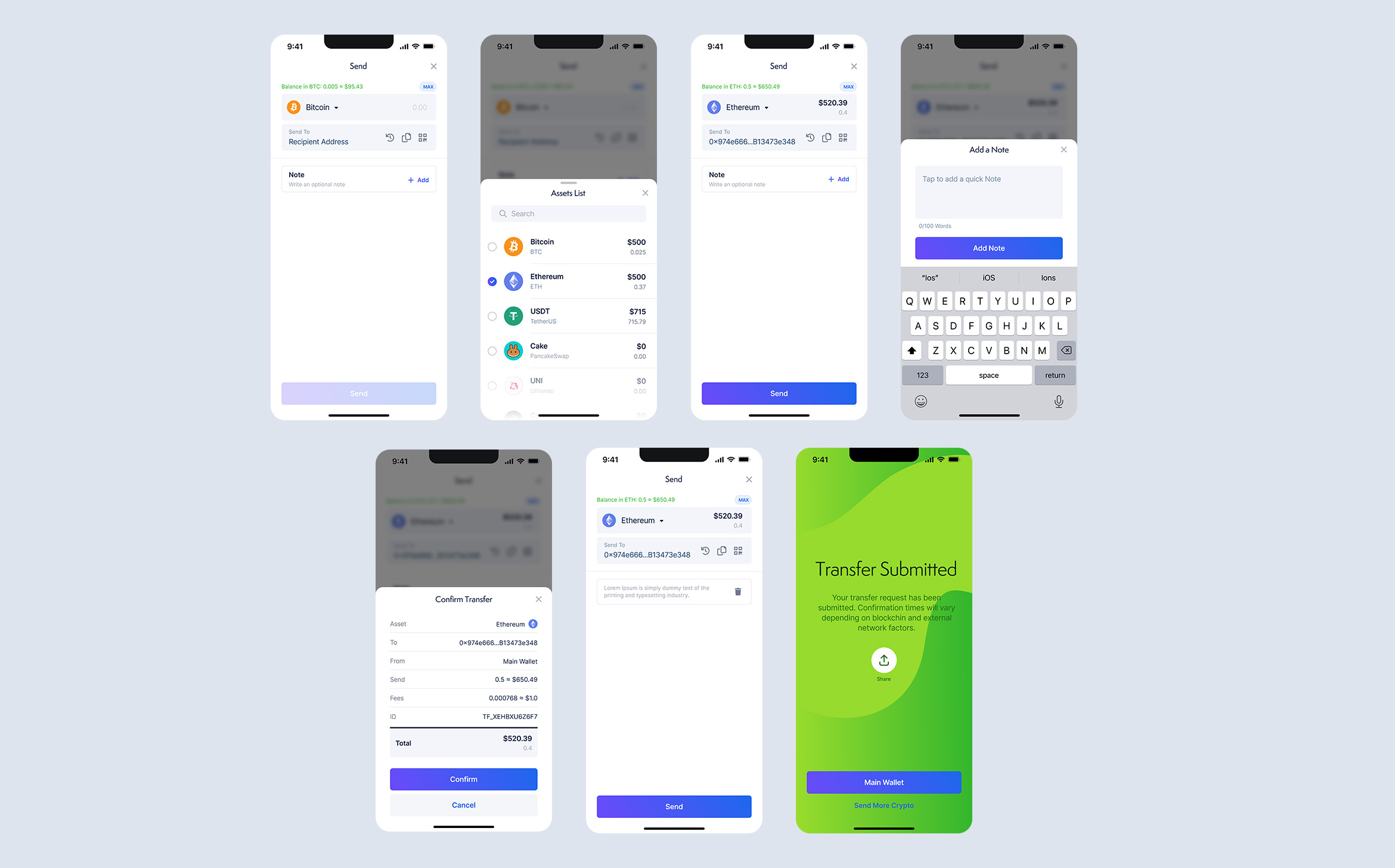
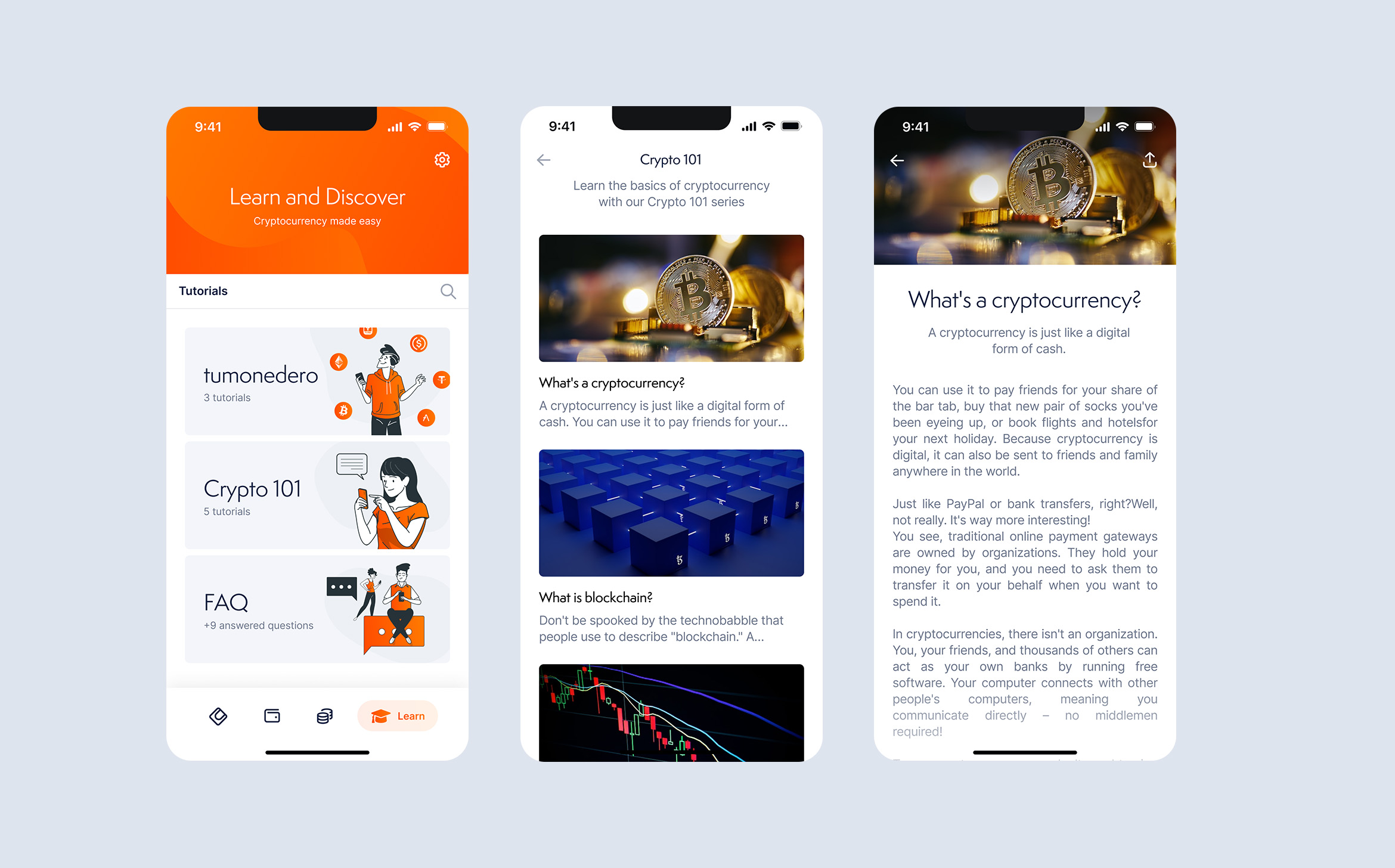
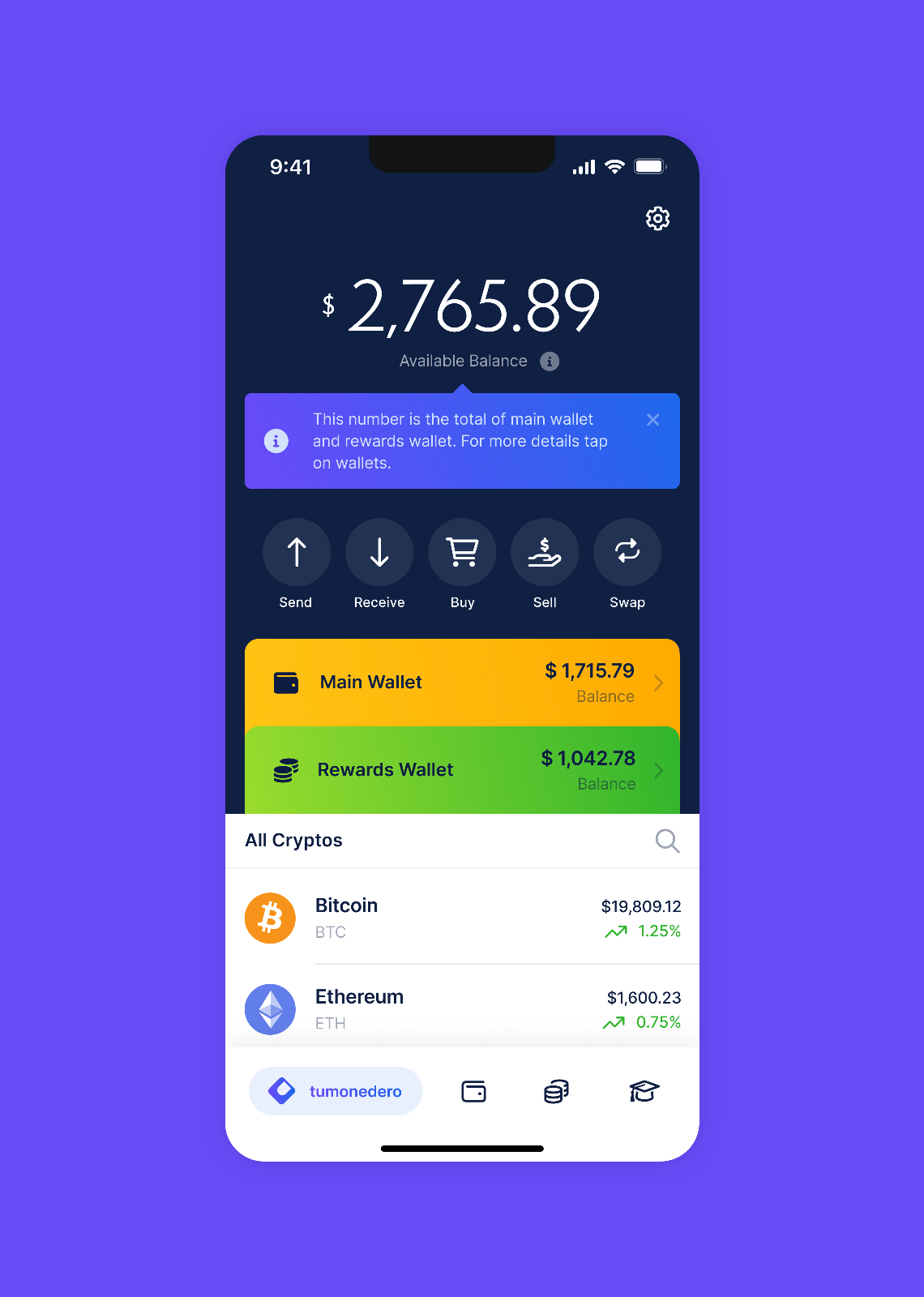
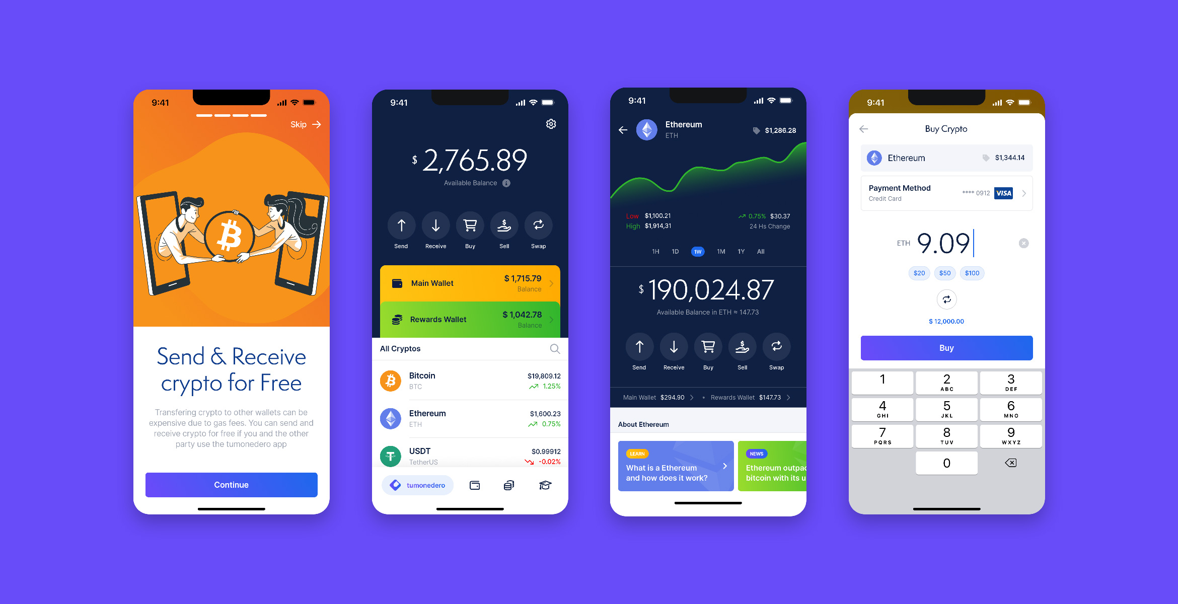
A mobile app that allows you to earn interest on your savings, learn about crypto from experts, and buy, sell and swap crypto easily. With Tumonedero, you have access to a high-yield savings wallet, a community of crypto specialists, and a seamless crypto trading experience.
Tumonedero is designed for people between 30 and 50 who are Spanish speakers living in the US and have no experience in crypto. The app's primary goal is to allow users to invest their savings in the non-traditional crypto market.
Project
Designing a mobile app from scratch was an exciting process that required a team effort. The success of the app depended on the collaboration of designers, developers, managers and stakeholders.
To begin the design process, I conducted extensive research to understand the audience's needs and expectations. I gathered data on their financial habits, their level of experience with crypto, and their preferences when it comes to mobile apps. This research informed my design decisions, ensuring that the app met the needs of the target audience.
The design process involved a team effort and began with extensive research to understand the target audience's needs and preferences. I worked closely with the team to brainstorm ideas and create wireframes and prototypes to test with potential users. The team focused on building a community through a user-friendly interface and social media channels.
The UI and UX design process involved research, wireframing, visual design, prototyping, user testing, and refinement.
In this section, I will explore the steps involved in the UI and UX design process.
- Research: The team started to benchmark to understand the target audience and their preferences clearly. The research also included an analysis of competitors and their apps to identify the gaps and opportunities.
- Wireframes: Once the research was completed, I created wireframes outlining the app's structure and layout of the most important sections and screens.
- Visual Design: Once the wireframes were approved, I moved on to the visual design stage. It involved selecting the color scheme, typography, and graphic elements. I ensured that the visual elements were consistent with the app's brand and messaging.
- Prototyping: I created a static but interactive prototype that allowed the team to test the app's usability and identify areas for improvement.
- User Testing: The team gathered feedback from potential users to identify areas for improvement. The feedback was used to refine the app's UI and UX and make it more user-friendly.
Based on that feedback, I refined the app's UI and UX. I made adjustments to the visual design and improved the app's usability. The refinement process was iterative, and the team needed to repeat steps 4 and 5 until they achieved the desired results. - Implementation: The development team implemented the design into the app. I worked closely with the developers to ensure the final product matched the design specifications.
Conclusion
Designing a mobile app from scratch was a collaborative process that required extensive research, brainstorming, and testing. By prioritizing our target audience's needs and expectations, I was able to design an app that met the app's user needs.
Selected Works
