XpressDocs
Create, customize and distribute marketing materials
Industry
Print and MKT
Services
UI & UX Design
Client
XpressDocs
Year
2020/24
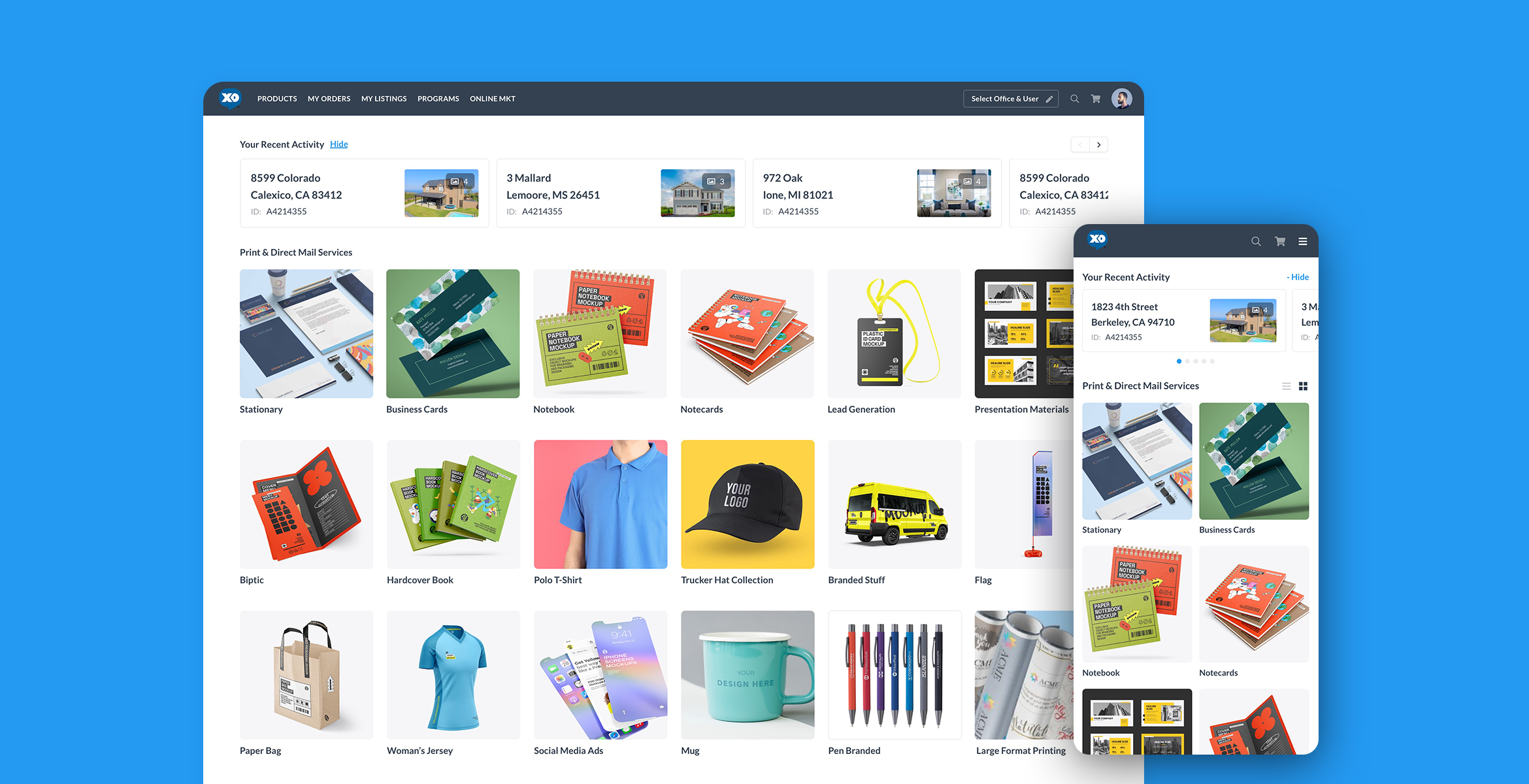
Background
Xpressdocs is a company that operates in the printing and marketing industry. Its online platform allows businesses to create, customize, and order printed materials such as postcards, brochures, flyers, and business cards. It serves small to medium-sized businesses in various industries, including real estate, healthcare, financial services, and non-profit organizations.
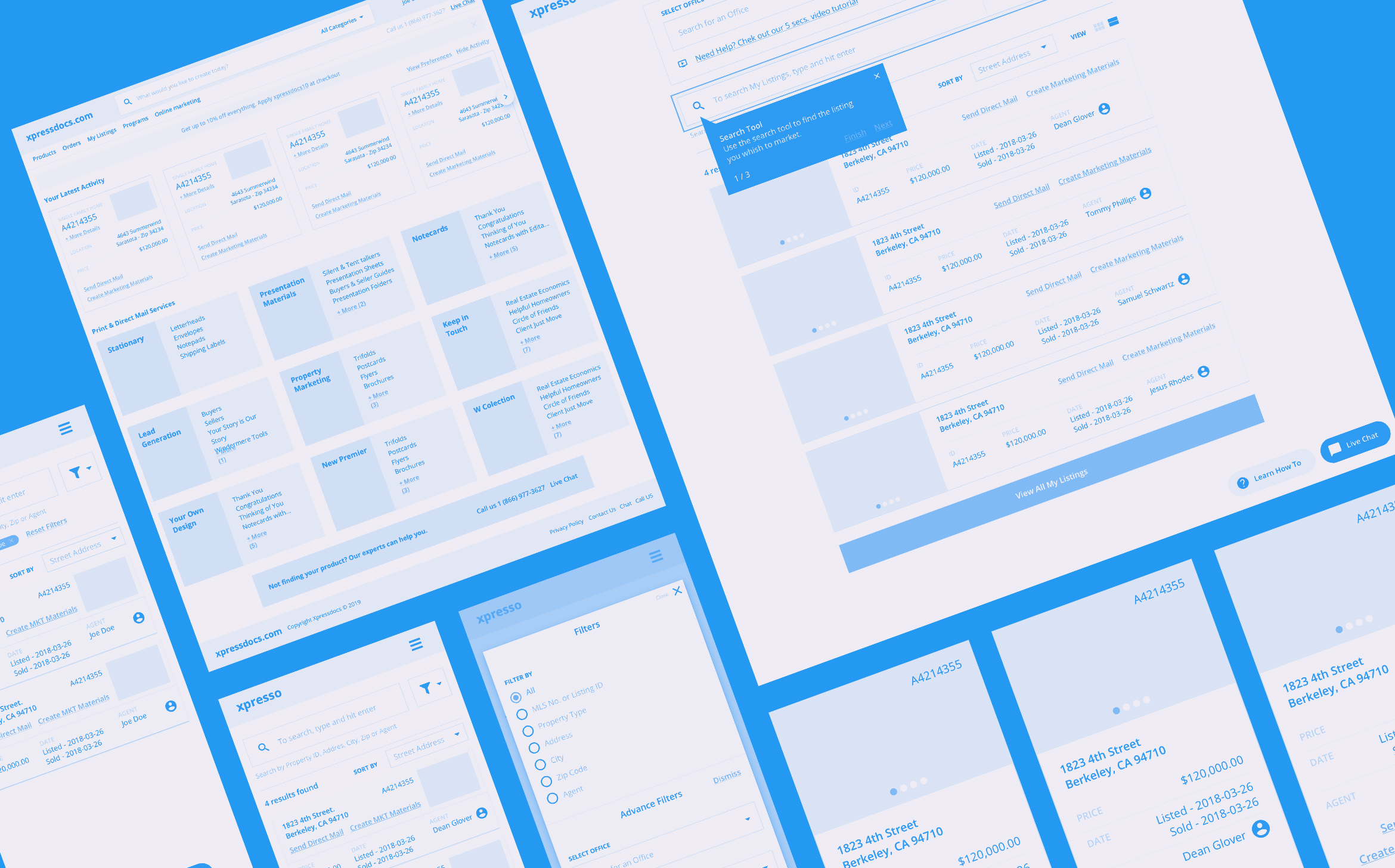
How the old platform used to look and behave
The Problem with the old platform
The platform had become outdated and no longer met its users' needs. The company's user base had grown, and customers demanded more modern features and capabilities. However, the platform's architecture and design made it challenging to implement these changes, leading to frustration for both the company and its users. Additionally, the platform's slow load times and limited scalability hindered the company's ability to expand its services to new markets. The company recognized that its platform must be redesigned to address these issues and remain competitive.
Goals
Improve the user experience based on customer support feedback and random user interviews. Offer an outstanding product to allow the company to remain competitive in the market, expand its services, and improve its conversion rate. Guarantee access to the platform through all kinds of devices.
Redesign Process
The process of redesigning our platform began with conducting user research to identify pain points and gather feedback. Armed with this information, I created wireframes to provide a rough visual representation of the new design. These wireframes allowed us to test the overall layout and functionality before moving on to more detailed design work.
Once the wireframes were in place, I focused on developing a new, user-centric interface that is easy to navigate and accessible across all devices. We implemented management tools such as Microsoft Teams, Jira, and Invision to facilitate collaboration among team members. These tools helped us track tasks, monitor progress, and schedule weekly calls to discuss and iterate on tasks.
The team and I meticulously iterated on the design, blending new trends with functional efficiency. This approach resulted in a seamless user experience that resonated well with our diverse user base. The final design underwent extensive usability testing, and the feedback received was incorporated into the final product.
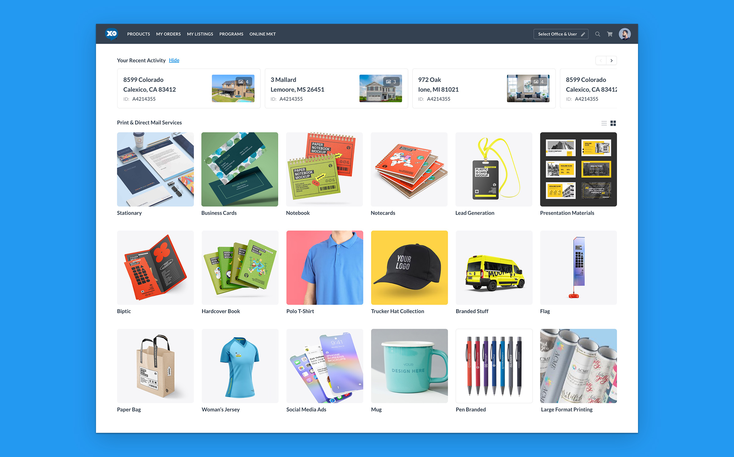
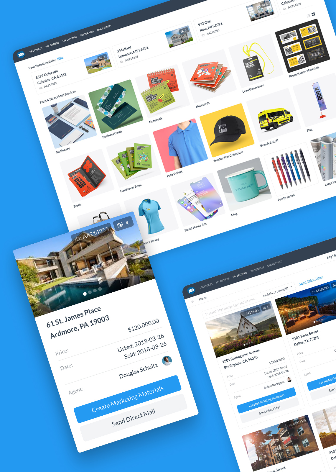
I'm excited to share a few selected mockups, out of over 600 created, that expose the most important functionalities, features, and layouts.
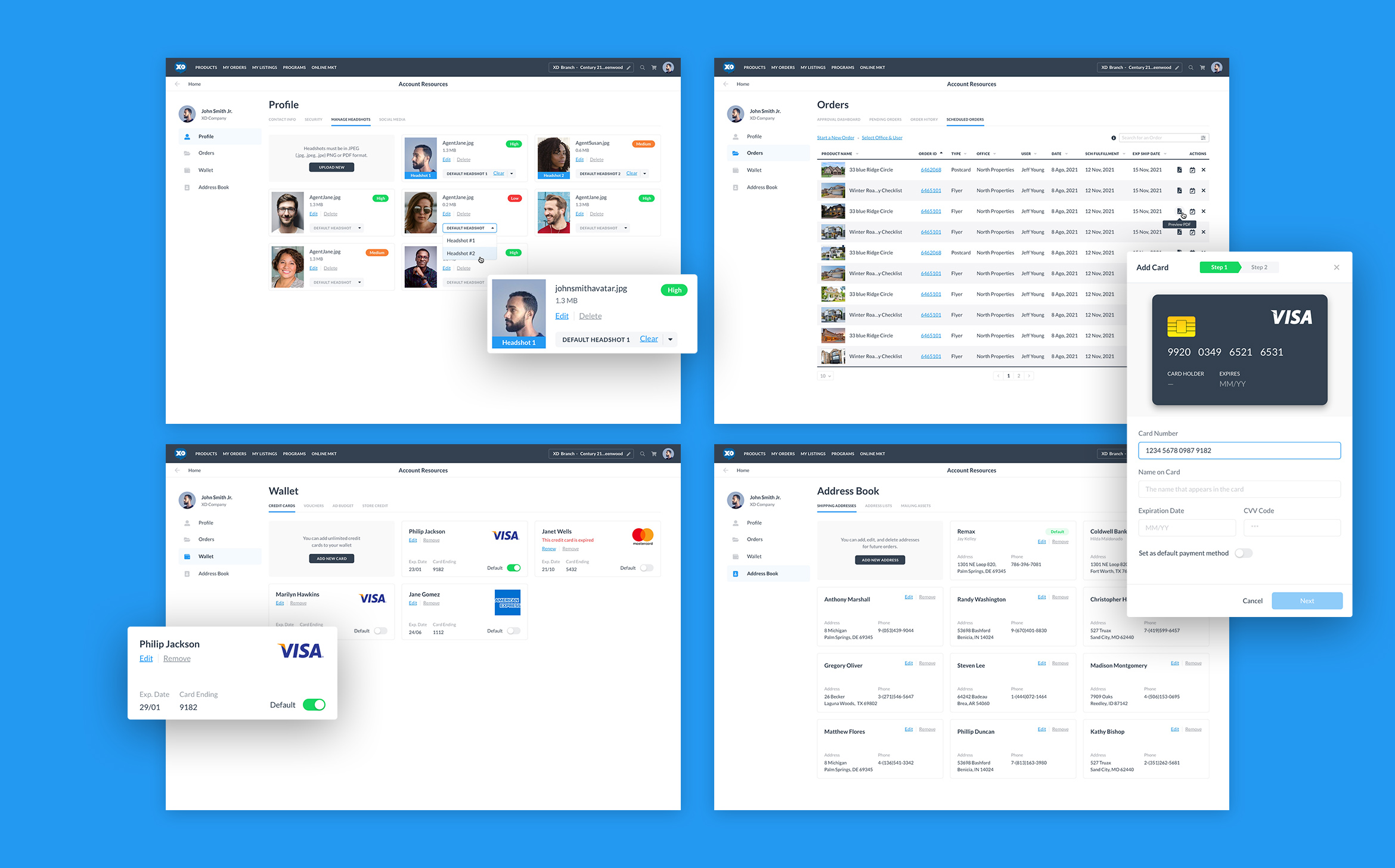
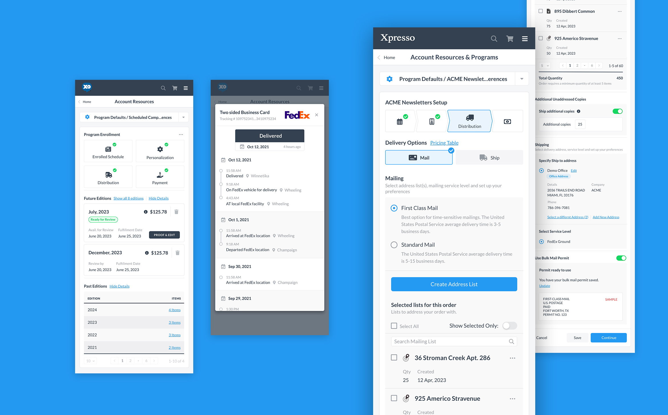
My Account: In the "My Account" section, users can manage personal information, billing and payment details, and shipping addresses. They can access order history, save and reuse customized marketing templates, set preferences for notifications, and manage account security settings. Additionally, users can handle subscription or membership details, if applicable, and access support resources and customer service contact information, ensuring a personalized and efficient experience.
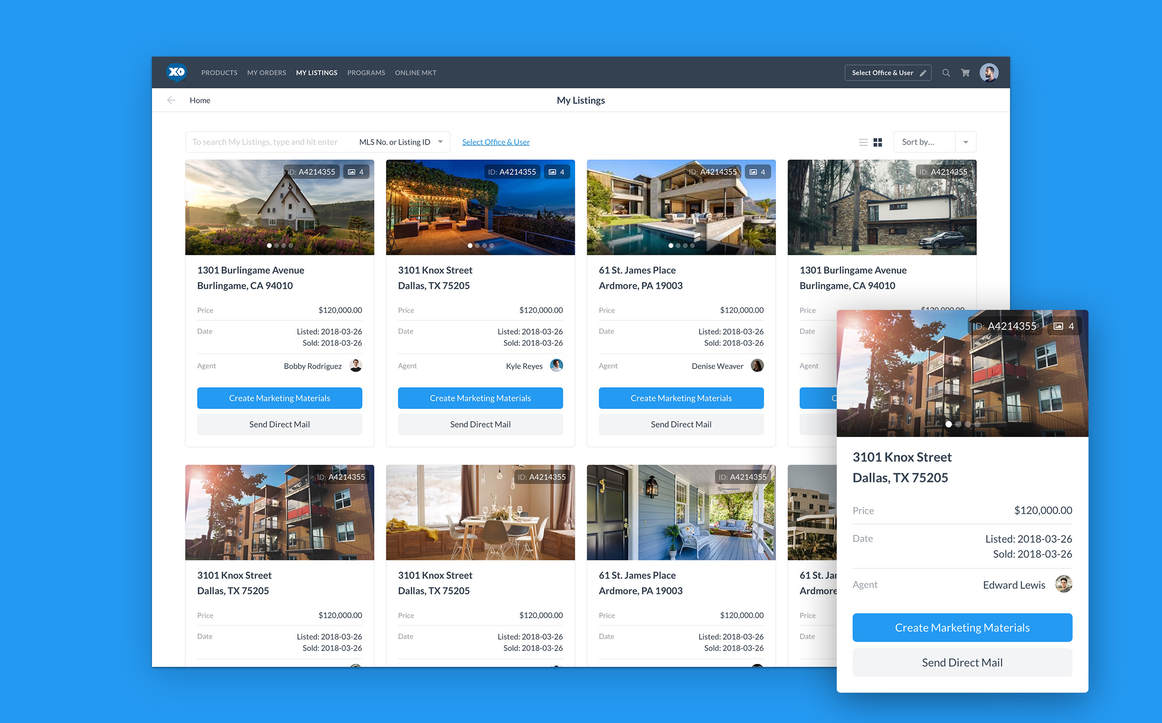
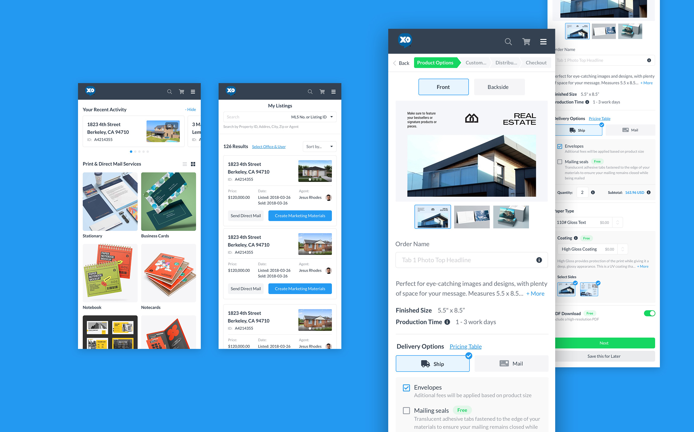
My Listing: Streamlines real estate marketing by providing a centralized system for managing property listings. Users can upload and update listings, customize templates, and generate professional marketing materials such as flyers and postcards. The platform integrates with Multiple Listing Services (MLS) for seamless data import and offers both print and digital marketing solutions, including direct mail and online campaigns. It ensures brand consistency, provides tracking and analytics for campaign performance, and offers customer support to optimize marketing efforts, allowing real estate professionals to efficiently promote their properties.
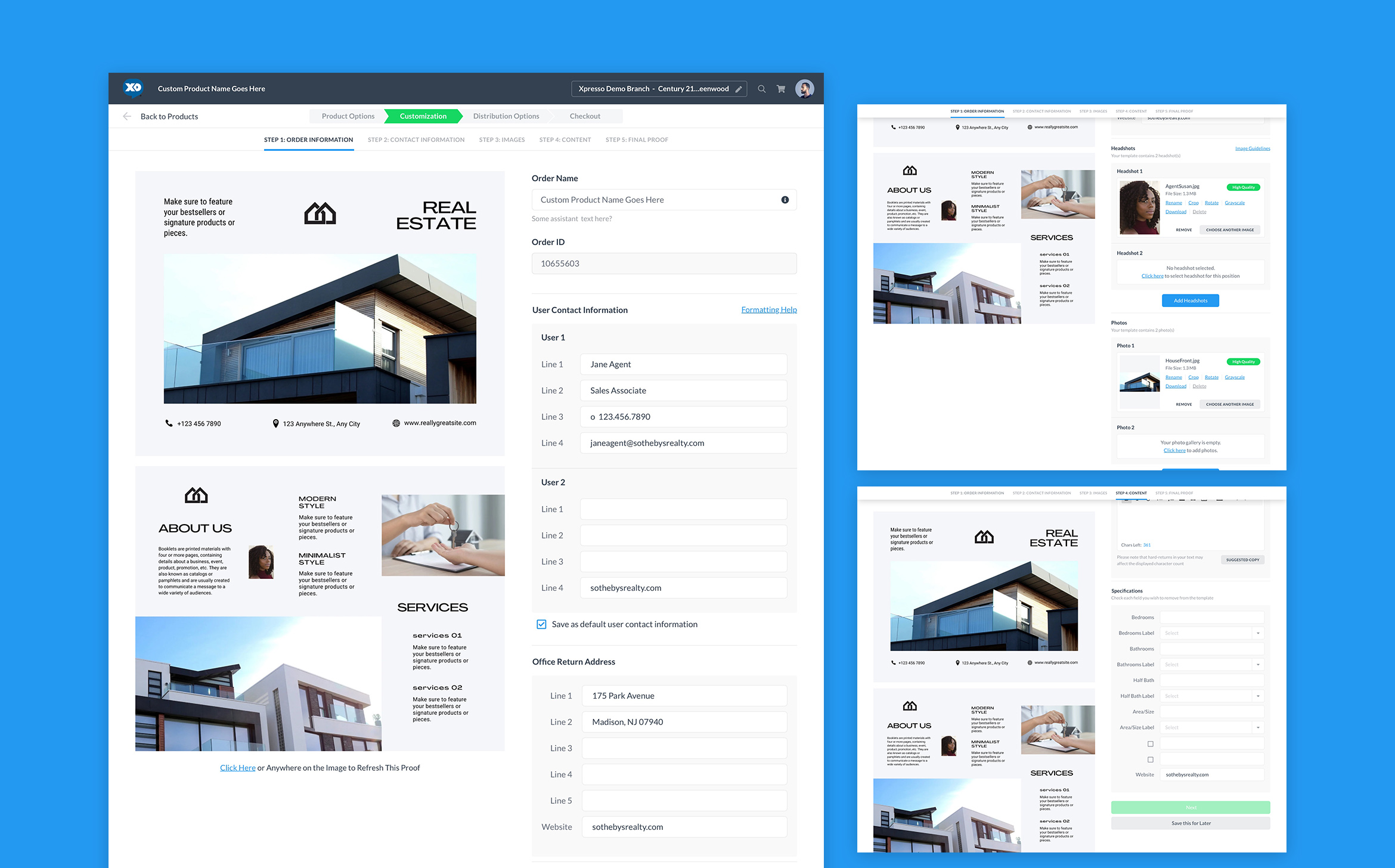
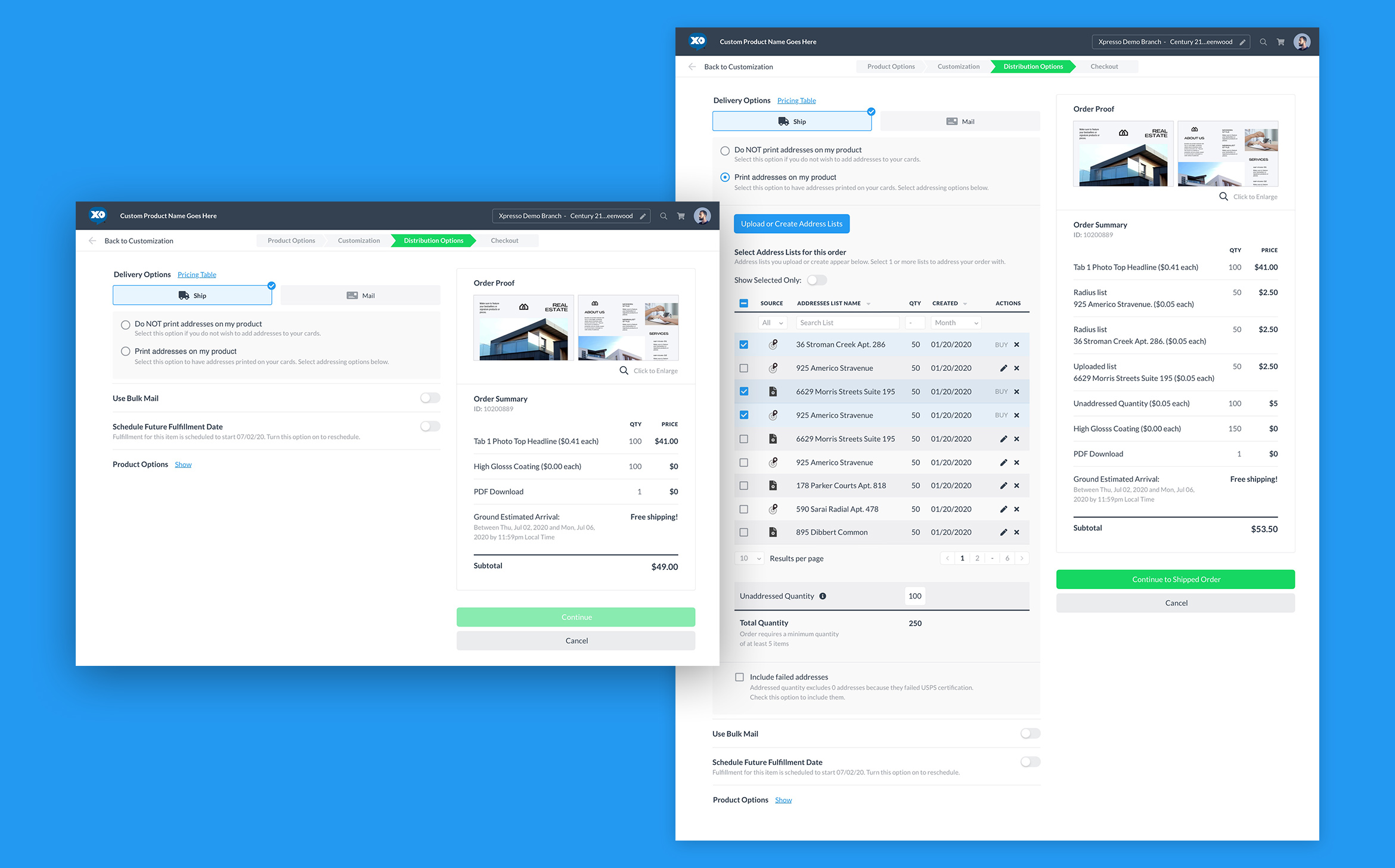
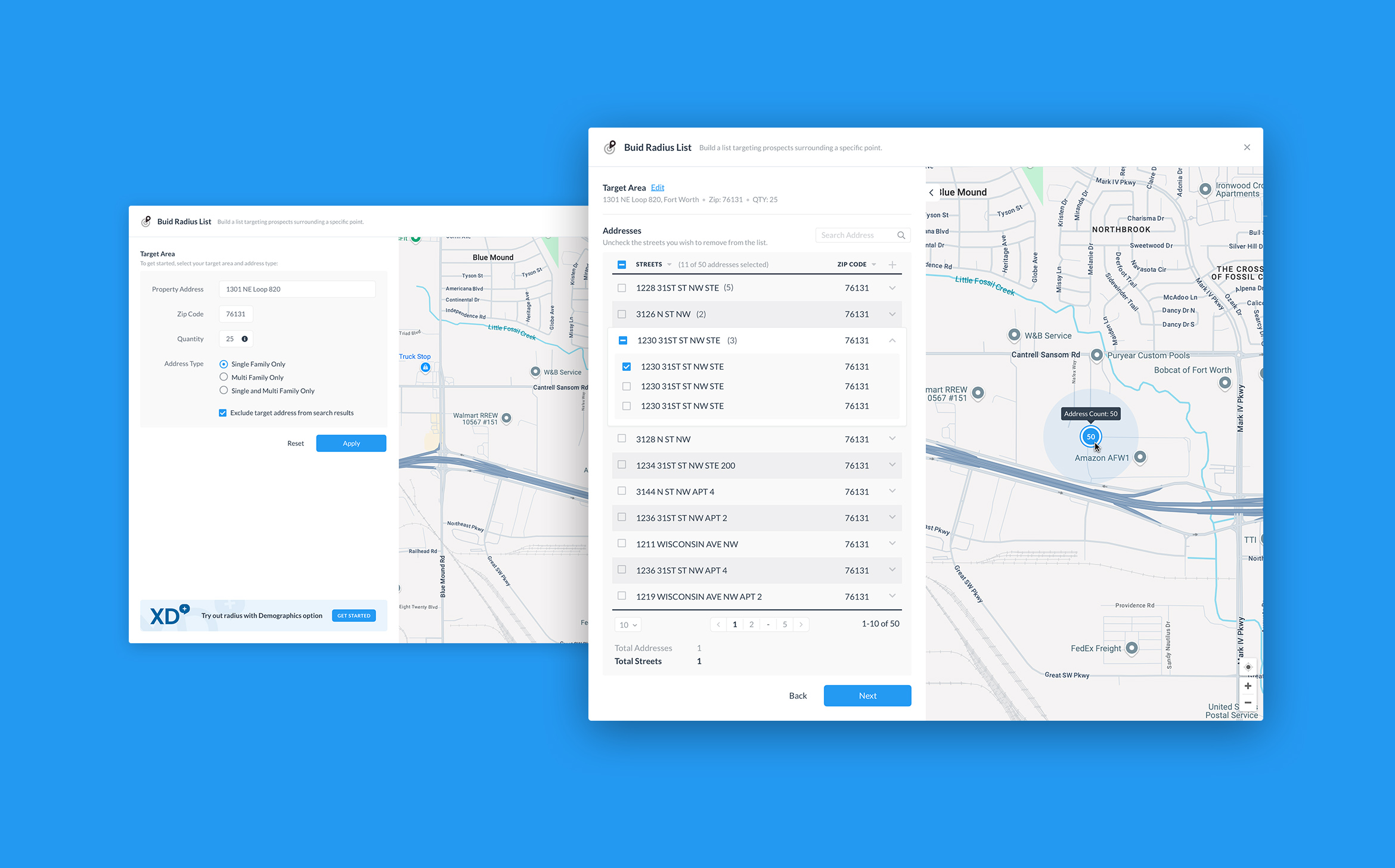
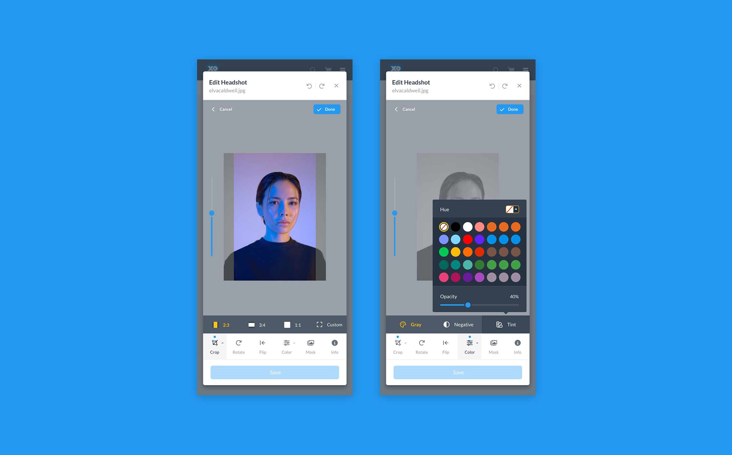
Product Customization: The customizations allows users to personalize marketing materials through an intuitive process. Users select from a variety of templates and utilize customization tools to add text, images, logos, and adjust design elements to match their brand. The platform supports variable data printing for personalized details and offers a proofing process to ensure accuracy. Once finalized, Xpressdocs handles the printing and can either ship the materials to the user or distribute them via direct mail. Integration with services like MLS for real estate ensures seamless data import, maintaining brand consistency throughout the process.
The new optimized customization approach simplifies and enhances the user experience by providing an intuitive interface with hint text for assistance, informative tips, and customer support help. This saves time and ensures consistency and professional quality in the final products. This reassures users that the overall marketing process is more efficient and stress-free while maintaining the high standards of the products.
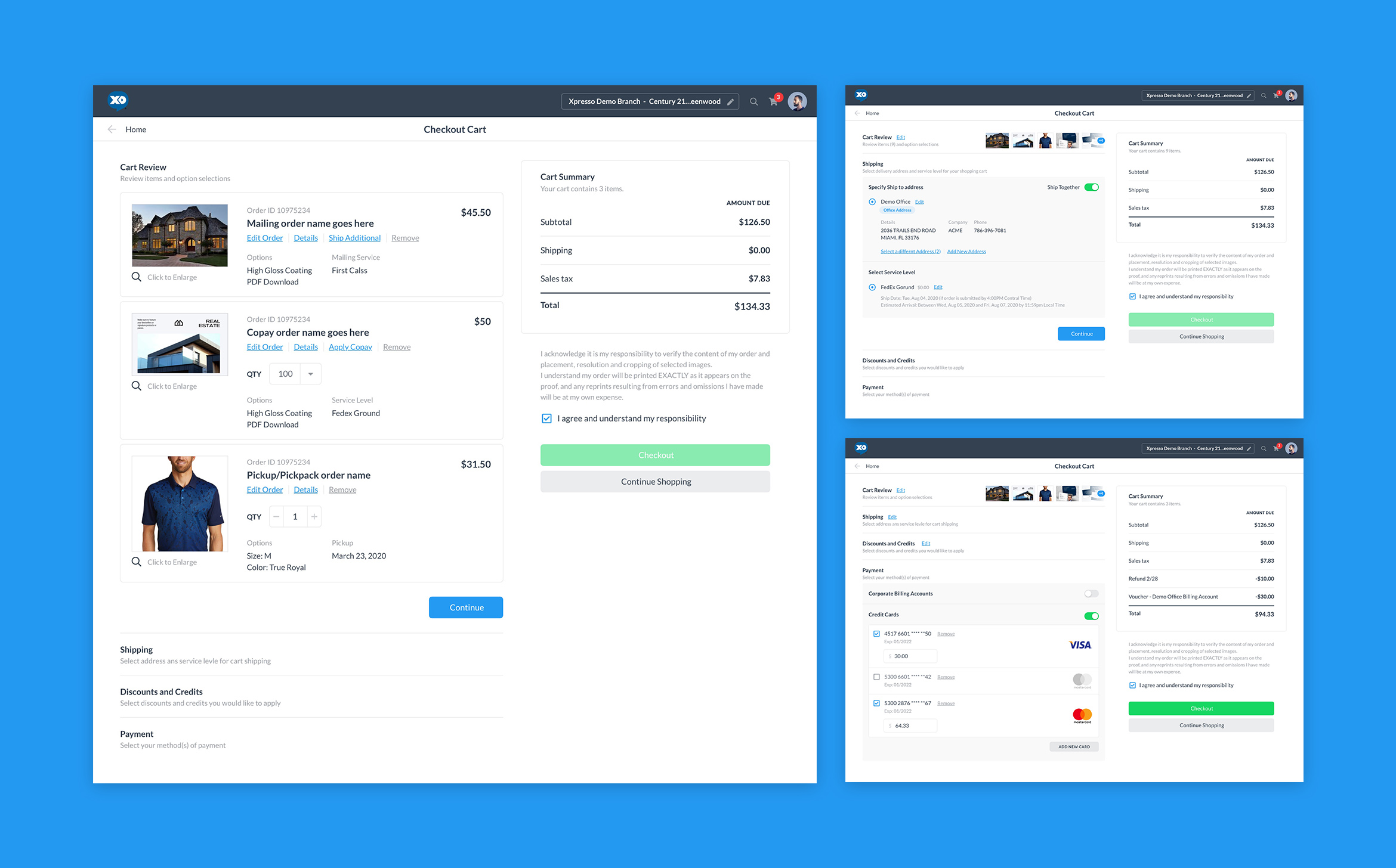
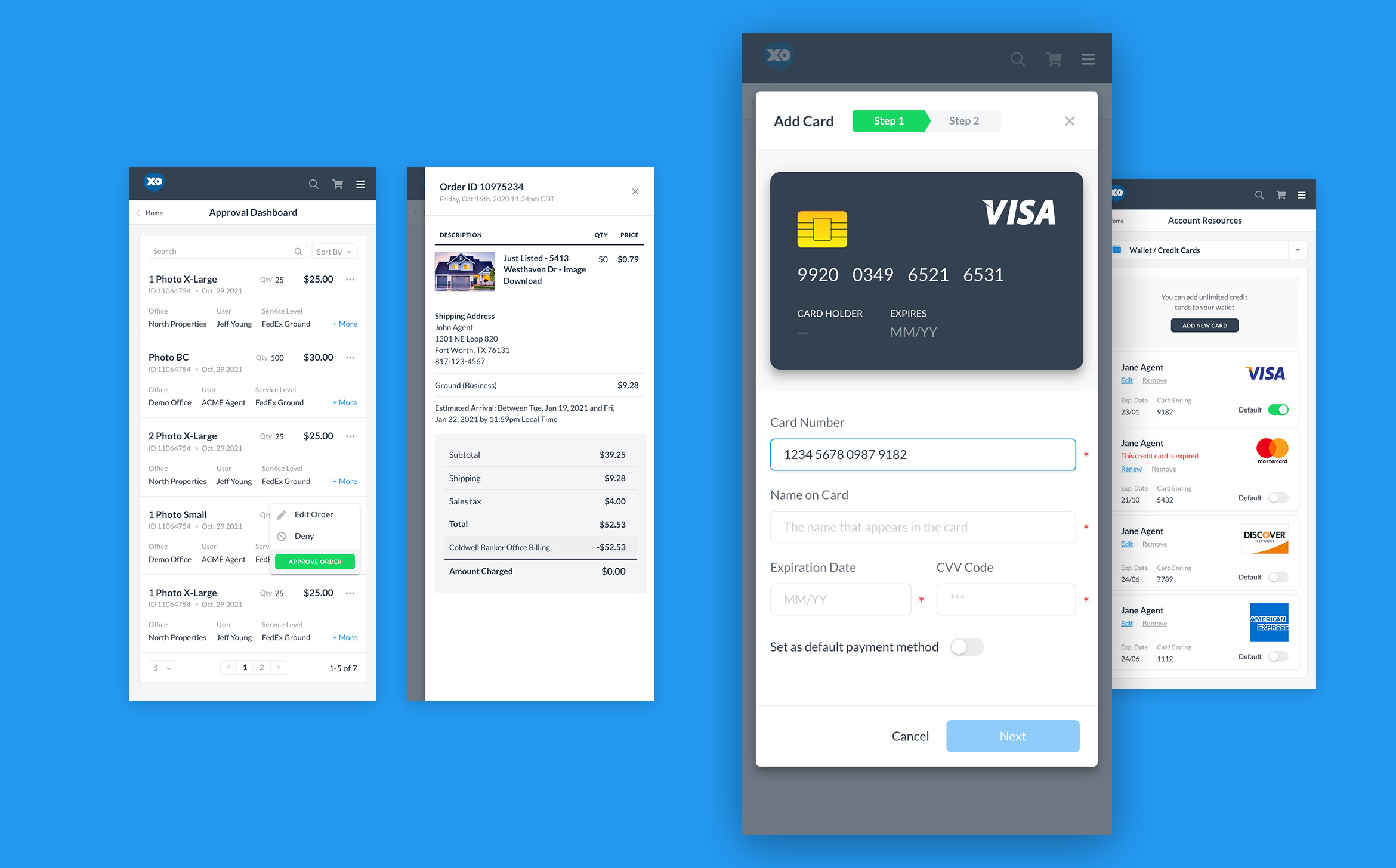
Check Out: The checkout process at Xpressdocs is user-friendly, secure, and comprehensive, allowing users to review their order details, choose shipping options, and enter payment information, including applying discounts or promo codes. An order summary is provided for final verification before submission, followed by an order confirmation email with details and a receipt. Users can track their order's production and shipping status through the platform, and customer support is available to assist with any issues. This ensures a smooth and efficient experience from start to finish.
The new and simplified checkout flow, guides users step by step, allowing them to place orders, select shipping methods, and complete payments all within a single, cohesive interface. This seamless process eliminates the need to refresh the platform or navigate through multiple pages, reducing the time required by 50%.
Responsiveness
Designing the mobile screens for the Xpressdocs platform was a complex and challenging process that required careful consideration of user experience and functionality on smaller devices. One of the primary challenges was ensuring that the rich features and extensive customization options available on the desktop version were effectively adapted to the mobile interface without compromising usability.
Balancing aesthetics with functionality, I incorporated intuitive gestures and simplified interactions to enhance accessibility and ensure a smooth user journey. One example of this is that I chose to avoid using tables and opted for cards instead wherever possible.
This process involved iterative testing and refinement to tackle these challenges effectively, ultimately resulting in a mobile experience that is both robust and user-friendly.
Results
The redesign of Xpressdocs's platform helped the company improve its business success. The user-centric approach to the design made the platform more appealing to users, leading to increased customer satisfaction and loyalty. As a result, the company saw an increase in its customer base, which led to increased revenue and profits.
In conclusion, Xpressdocs' decision to redesign its platform was a success. The company's focus on creating a user-centric design helped it meet the needs of its users and improve its business success.
This ongoing project has involved the creation of over 600 screens, encompassing a wide range of scenarios, user journey flows, micro-flows, user interactions, and both mobile and desktop views. In this case study, I am showcasing a few key screens highlighting the platform's most important sections and functionalities, demonstrating the critical elements contributing to its improved usability and efficiency.
600+ screens and counting
Selected Works
